What Color Should Bathroom Accessories Be? A Practical Guide
Bathroom Accessory Color Matcher
Answer three simple questions to find the perfect accessory palette for your bathroom.
Primary Colors
Accent/Metal Finish
Pro Tip
Why this works?
Select your options and click "Get My Recommendations" to see your custom bathroom style guide.
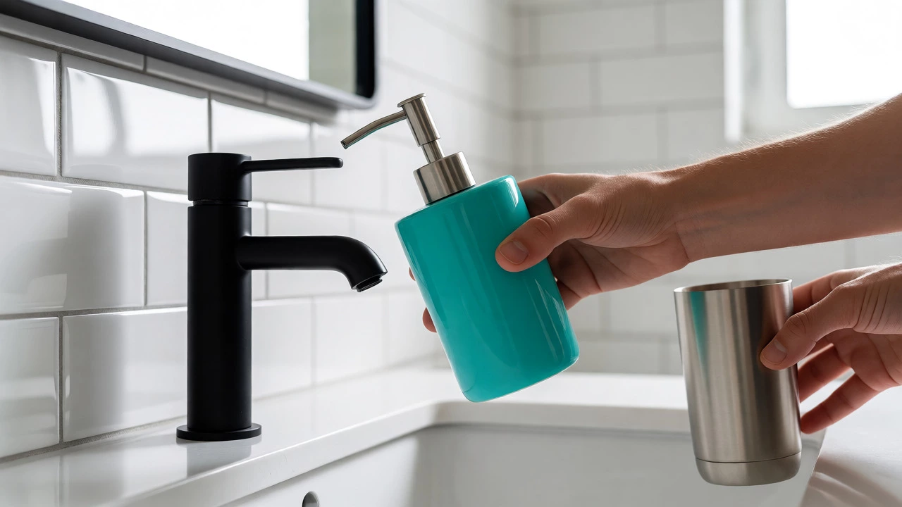
You stand in front of your mirror, holding a bright teal soap dispenser against the wall. It looks weird. You try a matte black one next. Better, but maybe too harsh? This paralysis is real. Choosing bathroom accessories colors isn't just about picking what you like; it's about balancing aesthetics with the practical reality of a room that gets wet, steamy, and cluttered fast.
Most people overthink this. They buy a trendy set, hang up towels, and realize six months later that the white toothbrush holder has turned yellow or the chrome tapware shows every water spot. The right color choice depends on three things: your existing fixtures, how much light you have, and how often you want to clean.
Start With Your Fixed Elements
You can't change your tiles or your bathtub easily, so those are your anchors. If you have stark white subway tiles and a white tub, you have a blank canvas. This is great because almost anything works, but it also means you need to define the style yourself. White-on-white can feel sterile if you don't add texture or contrast.
If you have beige, brown, or gray tiles, you're already limited. Warm tones like gold, brass, or wood accents pair beautifully with beige and cream. Cool tones like silver, chrome, or matte black look sharper against cool grays and blues. Trying to mix warm wood tones with cool blue tiles often creates visual friction unless you're an experienced designer. Stick to the temperature of your fixed elements.
Check your hardware first. Do you have chrome taps? Then sticking to metallic finishes for accessories keeps things cohesive. If you have brushed nickel, don't throw shiny gold plastic baskets at it. Mismatched metals can look accidental rather than eclectic. If you want to mix metals, use one dominant metal (say, 70% chrome) and one accent metal (30% brass), and keep them separated by distance or material.
The Power of Neutral Basics
Here is a secret interior designers rarely shout from the rooftops: neutrals aren't boring; they are forgiving. In a bathroom, dirt shows. Hair shows. Toothpaste splatter shows. Black accessories hide dust well but show water spots and lint terribly. White accessories look crisp initially but turn dingy quickly if not cleaned weekly.
For most homes, soft neutrals are the safest bet. Think charcoal, slate gray, taupe, or deep navy. These colors mask daily wear better than pure white or jet black. A dark gray tumbler hides water marks far better than a clear glass one. A navy towel rack doesn't show fingerprints like polished steel does.
If you rent or plan to sell soon, stick to neutral palettes. Bright pink or lime green accessories scream 'personal taste' and might clash with the next buyer's vision. Neutrals allow future owners to project their own style onto the space without needing to rip out your soap dishes immediately.
Small Bathrooms Need Light Colors
Size matters when choosing color. In a tiny powder room, heavy dark colors can shrink the space further. Dark walls plus dark accessories equal a cave. If your bathroom is under 5 square meters, lean toward lighter shades. Whites, creams, pale grays, and soft pastels reflect light, making the room feel airier.
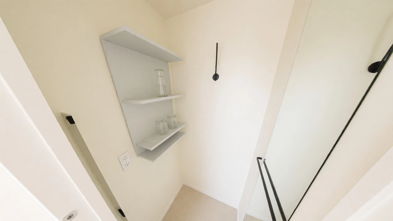
This doesn't mean you can't use black. Use black sparingly as a graphic line. A thin black frame around a mirror or slim black hooks on a white wall create definition without overwhelming the eye. Avoid bulky dark storage bins in small rooms. They eat up visual space. Instead, opt for open shelving with light-colored items or mirrored surfaces that bounce light around.
In larger bathrooms, you have more freedom. Darker colors add warmth and intimacy. A large master bath with high ceilings can handle a bold emerald green shower curtain paired with brass hardware. The scale supports the intensity. Just ensure you have enough lighting to counteract the absorption of light by dark materials.
Metal Finishes Are Not All Created Equal
Hardware color dictates accessory color. Let's break down the current landscape.
| Finish | Vibe | Best Accessory Colors | Cleaning Reality |
|---|---|---|---|
| Chrome | Classic, Clean, Industrial | White, Silver, Clear Glass, Navy | Shows water spots instantly; needs daily wipe-down |
| Brushed Nickel | Soft, Modern, Forgiving | Gray, Taupe, Matte Black, Wood | Hides fingerprints and water spots well |
| Matte Black | Bold, Contemporary, Edgy | White, Concrete Gray, Brass Accents | Shows dust and soap scum clearly; easy to scratch |
| Brass/Gold | Luxe, Warm, Vintage | Cream, Emerald Green, Blush Pink | Tarnishes over time; avoid harsh cleaners |
Notice the cleaning column? That's crucial. If you hate scrubbing, brushed nickel is your best friend. It looks expensive but behaves casually. Chrome demands respect. Matte black demands gentleness. Choose based on your cleaning habits, not just Pinterest photos.
Material Matters More Than Hue Sometimes
A white ceramic jar and a white plastic jar read differently. Ceramic feels solid and intentional. Plastic feels temporary. When choosing color, consider the material's inherent tone. Natural materials like bamboo, teak, or stone bring warmth that paint cannot replicate.
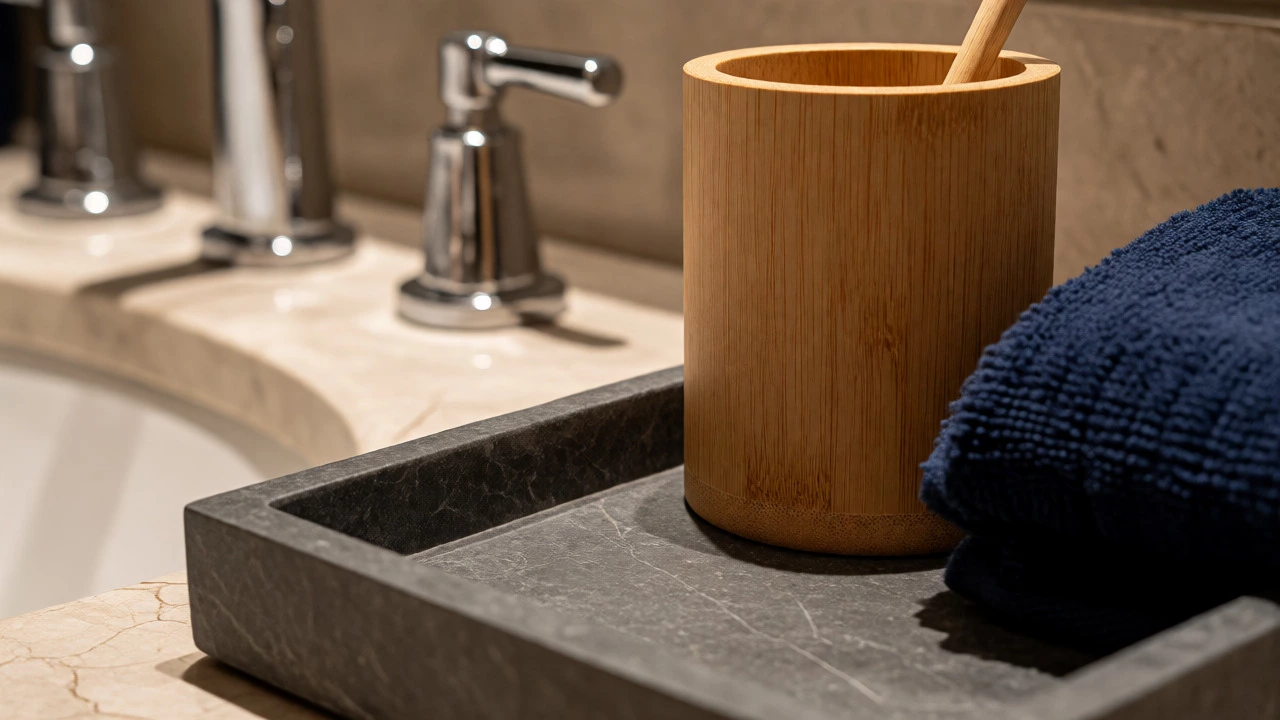
Bamboo accessories work in almost any color scheme because they act as a neutral earth tone. They soften hard edges in a minimalist white bathroom. Stone trays in marble patterns add luxury without committing to a specific solid color. Marble veining picks up subtle hints of gray, white, and black, tying together disparate elements.
Glass is another wildcard. Clear glass disappears visually, which is great for small spaces. Frosted glass adds texture while maintaining lightness. Colored glass, like amber or cobalt, should be used as art pieces, not bulk storage. Too many colored glass bottles look like a pharmacy shelf.
How to Mix Patterns and Colors Without Chaos
You don't need everything to match perfectly. Matching sets look dated. Instead, aim for coordination. Pick two main colors and one accent. For example, if your walls are white and tiles are gray, choose charcoal as your primary accessory color and mustard yellow as your accent. Keep the third element neutral, like wood or clear glass.
Use the 60-30-10 rule adapted for accessories. 60% of your visible items should be neutral (towels, rugs, large bins). 30% should support the theme (shades of gray, beige, or metallics). 10% can be playful (a bright red soap dish, a patterned toothbrush holder).
Textiles are your easiest way to inject color. Towels and rugs are cheap to replace. If you get bored of sage green towels, swap them for terracotta ones in ten minutes. Don't commit to painted furniture or permanent fixtures for color experiments. Save the bold moves for items you can toss in the washing machine.
Lighting Changes Everything
Your bathroom lighting affects how colors appear. Most bathrooms have cool, blue-toned fluorescent or LED lights. These make whites look bluish and yellows look muddy. If your bulbs are 4000K or higher, they will distort warm accessory colors.
Test your choices under actual conditions. Bring the sample home. Put the navy towel on the rack. Turn on the morning light. Turn on the evening vanity light. Does the navy look black? Does the cream look sickly? Adjust accordingly.
Natural light is rare in bathrooms. If you have no windows, rely on layered lighting. Add a warm bulb (2700K-3000K) in sconces near the mirror. This warms up skin tones and makes neutral accessories look inviting rather than clinical. Cool bulbs are fine for task lighting but bad for ambiance.
Practical Checklist Before You Buy
- Match the Metal: Ensure all faucets, towel bars, and drain covers share the same finish or follow a deliberate mixing rule.
- Consider Humidity: Avoid porous materials like unsealed wood in shower zones. They warp and mold. Use sealed teak or resin instead.
- Check Scale: Large accessories overwhelm small sinks. Measure your countertop before buying oversized soap dispensers.
- Think About Maintenance: High-gloss surfaces show every drop of water. Matte finishes hide messes but may stain. Choose based on your cleaning frequency.
- Future-Proof: If you move often, avoid ultra-trendy colors like millennial pink or avocado green. Stick to timeless neutrals and classic metals.
There is no single 'right' color. There is only the right color for your specific combination of light, size, lifestyle, and existing fixtures. Start with your fixed elements, prioritize ease of cleaning, and use textiles for flexibility. Your bathroom will feel curated, not chaotic.
Should bathroom accessories match my towels?
Not necessarily. While matching can look tidy, it often feels staged. Aim for coordination instead. If your towels are blue, choose accessories in a complementary shade like gray or white, or use a metallic finish that ties into the room's hardware. Exact matching is optional; harmony is key.
Is matte black bathroom hardware difficult to maintain?
Yes, matte black shows water spots, soap scum, and dust more visibly than chrome or brushed nickel. It requires regular wiping with a dry cloth to prevent mineral buildup. However, it offers a modern aesthetic that many find worth the extra effort. Using hydrophobic coatings can help reduce spotting.
What color makes a small bathroom look bigger?
Light, reflective colors expand visual space. Whites, creams, pale grays, and soft pastels reflect light, making walls recede. Mirrors and glossy surfaces amplify this effect. Dark colors absorb light and can make a cramped room feel smaller, though they can add depth if used strategically on one accent wall.
Can I mix different metal finishes in the bathroom?
Absolutely, but do it intentionally. Choose one dominant finish (e.g., chrome for faucets) and one secondary finish (e.g., brass for cabinet pulls). Keep the ratio roughly 70/30. Ensure the metals share similar undertones (warm with warm, cool with cool) to avoid clashing. Mixing random finishes often looks messy.
Are white bathroom accessories practical?
White accessories look clean and bright but require frequent cleaning to stay that way. They show hair, dust, and discoloration from humidity quickly. If you choose white, opt for high-quality materials like ceramic or stainless steel that resist staining, and be prepared to wipe them down regularly to maintain their pristine appearance.