What Curtains Make a Room Look Expensive: A Design Guide
Luxury Curtain Visualizer
Assess your current window treatment or plan a new one. Select the options that best match your room's features to see how close you are to a "Designer Look."
Luxury Score
0%Design Recommendations:
You walk into a hotel lobby or a friend’s beautifully styled living room and immediately feel the vibe shift. It feels curated, calm, and yes, expensive. You look around for the secret weapon. Is it the art? The sofa? Usually, it’s not those things at all. It’s the windows.
Most people treat curtains as an afterthought-a way to block light or hide from neighbors. But in the world of interior design, they are the jewelry of the home. The difference between a room that looks "rented" and one that looks "designed" often comes down to three specific choices: how high you hang them, what fabric you choose, and whether you use lining. You don’t need a five-figure budget to achieve this. You just need to stop making the common mistakes that cheapen a space.
The Height Hack That Changes Everything
If you change nothing else about your windows, change where the rod sits. This is the single most effective trick designers use to make a room look taller and more luxurious. Standard builder-grade installation usually places the rod just above the window frame. This visually cuts off the wall and makes ceilings feel lower.
To get that expensive look, mount your curtain rod four to six inches below the ceiling line. If you have crown molding, place the rod just above it. By drawing the eye upward, you create verticality. Your brain interprets this height as grandeur. Pair this with rods that extend eight to twelve inches beyond the width of the window on each side. Why? So when the curtains are open, they sit against the wall, not over the glass. This maximizes natural light and makes the window itself appear wider. It’s a simple geometric illusion, but it works every time.
Fabric Weight and Texture Matter More Than Color
Thin, flimsy polyester curtains flutter like flags in a breeze. They look temporary. Expensive curtains have weight. They drape heavily and fall in soft, deliberate folds. When shopping for drapery fabric, ignore the color swatch first and check the hand-feel instead.
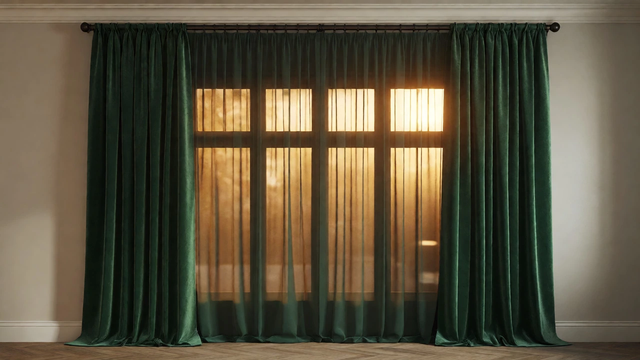
Look for materials with structure. Velvet is the gold standard for luxury because it absorbs light and holds its shape. Heavy linen blends offer a relaxed, organic elegance that feels current and sophisticated. Silk is beautiful but notoriously difficult to maintain; if you want the sheen without the dry-cleaning bill, opt for a high-quality satin or silk-like synthetic blend with a matte finish. Avoid anything that feels slick or plastic-like. If you can see through the fabric when you hold it up to a light bulb, it’s too thin. Real luxury has opacity and substance.
| Fabric Type | Visual Effect | Best For | Maintenance Level |
|---|---|---|---|
| Velvet | Rich, deep shadows, formal | Living rooms, bedrooms | Moderate (vacuum regularly) |
| Heavy Linen | Crisp, airy, textured | Modern, coastal styles | High (wrinkles easily) |
| Silk/Satin | Luminous, reflective | Dining rooms, formal spaces | Very High (dry clean only) |
| Wool Blend | Matte, substantial, warm | Offices, studies | Low (durable) |
The Secret Weapon: Full Lining
This is the detail that separates amateur setups from professional installations. Unlined curtains hang flat and limp. They cling to the window glass and show every seam. Lined curtains stand away from the wall slightly, creating a subtle shadow gap that adds depth. More importantly, the lining gives the fabric body. It allows the pleats to hold their shape even when the curtains are pulled back.
You don’t necessarily need blackout lining unless you’re trying to sleep during the day. A standard cotton sateen lining is sufficient for most rooms. It protects the face fabric from sun damage-which prevents fading-and adds that crucial weight. When you buy ready-made curtains, check the label. If it says "unlined," plan to pay extra for custom tailoring or buy a separate lining kit. The cost difference is minimal compared to the visual upgrade.
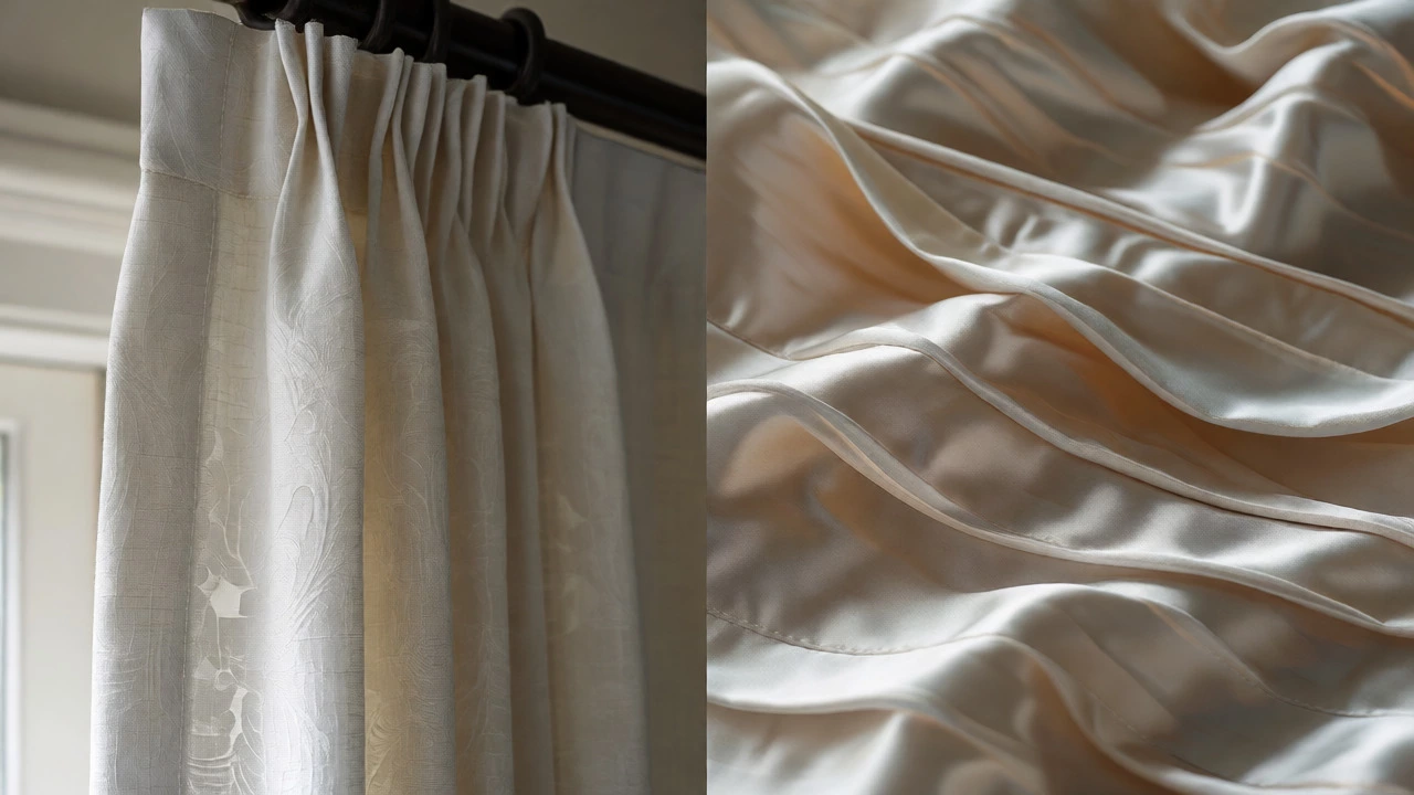
Pleat Style Dictates Formality
How the top of the curtain is gathered affects the overall formality of the room. Grommet tops (metal rings) are casual and modern. They work well in kids' rooms or minimalist apartments. Tab tops are rustic and relaxed. But if you want expensive, you want pleats.
Pinch pleats are the classic choice. They create uniform, tailored folds that scream sophistication. Ripple fold panels, which use a special track system to create continuous waves, are currently trending in high-end hospitality design. They look incredibly sleek and require no hooks or rings visible from the front. French pleats offer a softer, more romantic look. Choose one style and stick to it throughout the house for consistency. Mixing pleat styles can make a home look cluttered and unplanned.
Length Is Non-Negotiable
A floating curtain panel that stops two inches above the floor looks unfinished. It collects dust bunnies underneath and creates a visual break in the vertical line we worked so hard to establish. To look expensive, your curtains should either kiss the floor or pool slightly.
Measure from the floor to the bottom of the rod. Add half an inch for a "kiss" fit, which is practical for cleaning and prevents staining. Add two to three inches for a "break" or slight pooling, which looks more dramatic and luxurious in formal living areas. Avoid excessive puddling unless you have a very large, rarely used space, as it becomes a lint magnet. Precision here matters. If you’re buying off-the-rack, you will likely need to hem them. Most dry cleaners do this quickly and cheaply. Do not skip this step.
Hardware Should Disappear or Make a Statement
There are two ways to handle hardware. Either make it invisible or make it the focal point. Cheap-looking rooms often feature medium-weight brass rods that are neither hidden nor impressive.
For a clean, modern luxury look, use a recessed ceiling track. This hides the mechanism entirely, allowing the fabric to flow straight down from the ceiling. It’s seamless and architectural. For a traditional or glam look, invest in substantial finials and a thick rod. Thin rods bend under the weight of heavy velvet, ruining the drape. Ensure your brackets are anchored into studs or use heavy-duty anchors. Sagging rods are a dead giveaway of poor installation.
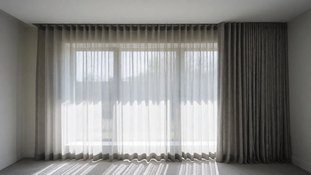
Layering Adds Depth
Single-layer window treatments can look flat. Layering adds dimension and versatility. The classic combination is a sheer inner layer paired with a heavy outer drape. Sheers diffuse harsh sunlight, protecting your furniture while maintaining privacy during the day. They also add a soft, ethereal quality that contrasts nicely with heavier fabrics.
Use a double rod or a dual-track system. Keep the sheers hung on the same height principle-ceiling to floor. This reinforces the vertical lines. When both layers are closed, you get full coverage and insulation. When only the sheers are closed, the room feels bright and airy. This functional flexibility is a hallmark of thoughtful design.
Color Strategy: Monochromatic Wins
Patterned curtains can be tricky. If done poorly, they compete with other elements in the room. The safest bet for an expensive look is monochromatic harmony. Choose a curtain color that matches your wall paint exactly, or is within one shade lighter or darker. This creates a seamless backdrop that makes the room feel larger and calmer.
If you want pattern, keep it subtle. Large-scale florals or bold geometrics can overwhelm a small space. Instead, look for tone-on-tone textures. A damask weave in cream-on-cream offers visual interest without shouting for attention. Remember, expensive interiors often whisper rather than shout. Let the texture and the drape do the talking.
Common Pitfalls to Avoid
- Using blinds behind curtains: Often, these clash in style and color. If you must have them, ensure the blinds are neutral and slim-profile so they disappear behind the drapes.
- Ignoring window proportions: Small windows can still benefit from floor-to-ceiling curtains. Don’t limit yourself to the size of the glass.
- Cheap tie-backs: Use matching fabric ties or simple metal rings. Novelty tie-backs look dated.
- Too much contrast: Stark white curtains against dark walls can sometimes look jarring. Softening the contrast creates a more cohesive, enveloping feel.
Achieving a high-end look isn’t about spending the most money. It’s about intentionality. It’s about respecting the architecture of your room by extending lines upward, choosing materials that behave well, and paying attention to the details that others overlook. Start with the rod height and the length. Those two changes alone will transform how your space feels.
Do I really need to hang curtains from the ceiling?
Yes, for the most part. Hanging curtains close to the ceiling draws the eye upward, making ceilings appear higher and rooms feel more spacious. Even if you have short windows, extending the treatment to the ceiling creates a custom, built-in look that standard builder-grade installations lack.
Is velvet too heavy for standard curtain rods?
Velvet is dense, so you need sturdy hardware. Thin decorative rods may sag. Opt for a solid wood, metal, or reinforced composite rod with proper bracket spacing (every 16-24 inches). Alternatively, use a ceiling-mounted track system which supports weight evenly along the entire length.
How wide should curtains be for a full look?
To achieve rich folds, the total width of your curtain panels should be 2 to 2.5 times the width of the window opening. For example, a 40-inch window needs 80 to 100 inches of curtain fabric. Less than that results in flat, skimpy drapes that look inexpensive.
Can I wash luxury curtain fabrics myself?
Check the care label first. Many heavy fabrics like velvet and lined silks require dry cleaning to preserve their structure and prevent shrinkage. However, many modern high-quality synthetics and some linens are machine washable on gentle cycles. Always test a small area first.
What is the best color for making a room look bigger?
Light, neutral colors that match the wall paint are best. Cream, beige, soft gray, or pale taupe blur the boundary between the wall and the window treatment, expanding the perceived square footage. Darker colors can make a room feel cozier but potentially smaller.