Should Curtains Be a Darker Colour Than the Room? Practical Advice for Homeowners
If you’ve stared at paint swatches and curtain samples, you already know: this is harder than it looks. You want the room to look pulled together, not like you threw darts at a color wheel. One of the first questions people ask is if curtains really need to be a darker color than the paint on your walls. The answer isn’t as cut and dry as some designers want you to believe.
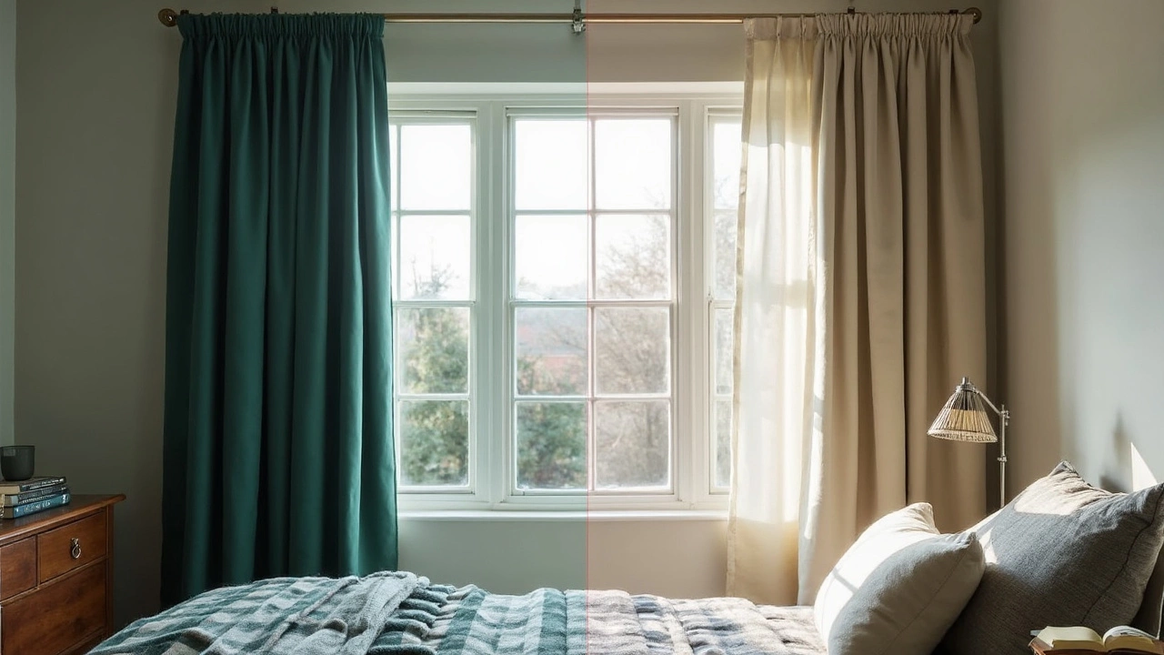
Here’s the deal—curtain color totally changes how a room feels. Darker curtains create a moody, cozy vibe, while lighter ones open things up and bounce around whatever sunshine comes in. Think about what you want for your room at 7 AM, or when it’s movie night: some folks want blackout power for sleep, others want the space as bright as possible.
- How Curtain Color Impacts Your Space
- Pros and Cons of Darker Curtains
- Going Lighter: What to Expect
- Creative Color Combinations That Work
- Tips for Choosing the Right Shade
How Curtain Color Impacts Your Space
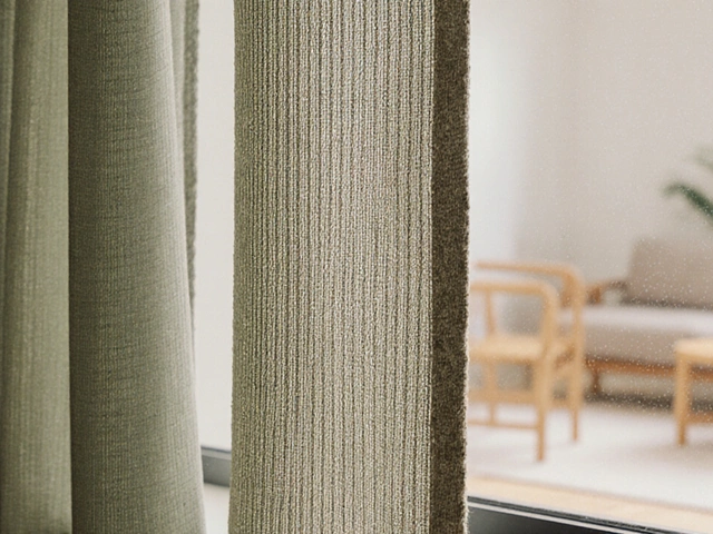
Curtains do more than just block sunlight or nosy neighbors—they set the whole mood of the room. If you ever felt like a room looks off and can't figure out why, it’s often the curtains clashing with the wall color. Curtain color has a real visual punch.
Darker curtains pull your eyes toward them. If you put deep navy curtains in a white or light gray room, suddenly your windows look bigger, and the space feels dramatic—or in small rooms, a little closed in. If the walls are already dark, dark curtains can make it cozier or even a tiny bit cave-like. Lighter curtains, on the other hand, blend in more, make windows look soft and casual, and help the place feel airy. Folks who love that big, open vibe usually go for lighter curtains than their walls.
Choosing the right color isn’t just a style thing—it has real effects on how you feel in your house. Here’s what to expect based on curtain color:
- Darker curtains: Great for privacy, blocking light, and creating a snug, restful spot—perfect in bedrooms or media rooms.
- Lighter curtains: Help sunlight spread out, boost your mood, and visually lift up low ceilings and tight corners.
- Matching or close tones to the wall: Makes rooms look smoother and bigger, with fewer harsh lines.
- Contrasting colors: Adds pop and interest—think bold red curtains in a neutral tan living room for instant energy.
Want something really solid? According to the National Sleep Foundation, “Dark, heavy curtains can help reduce light pollution in the bedroom, improving sleep quality.”
“Curtain color can make or break a room. Too dark, and you lose the energy; too light, and you might miss the cozy factor,” says Emily Henderson, interior stylist and HGTV host.
For those who love numbers, here’s a quick look at how curtain color might change room brightness:
| Curtain Color | Avg. Room Brightness Gain/Loss |
|---|---|
| Dark (navy, espresso, charcoal) | -20% brightness |
| Medium (mid-gray, sage, taupe) | -10% brightness |
| Light (white, ivory, pastel) | +5% brightness |
Think of your interior design like a team—color choices for curtains can change how the rest of your decor feels, even if you don’t move a single piece of furniture.
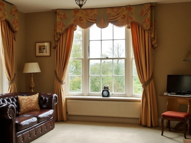
Pros and Cons of Darker Curtains
Darker curtains bring a lot of character, and they don’t just look dramatic for the sake of it. If you’re after privacy, these are a heavy hitter—block out nosy neighbors, city lights, or the blasting midday sun. Rooms with darker curtains also stay cooler in the summer since they’re really good at stopping sunlight and heat. Feeling like your bedroom gets stuffy? Blackout curtains can drop the temp by a couple degrees, even during a heatwave.
Want better sleep? This is where dark curtains shine. According to the Sleep Foundation, "Dark curtains and blackout panels are proven to help reduce outside noise and light, promoting better sleep quality."
Dark curtains and blackout panels are proven to help reduce outside noise and light, promoting better sleep quality. — The Sleep Foundation
On the flip side, darker home decor fabrics mean two annoying things: they show dust and lint more, and they’re tough to keep looking fresh if you’ve got pets or allergies. Kids with sticky hands? You’ll be doing extra cleaning, for sure.
- Interior design trick: In small rooms, deep colors can make things feel a little smaller or heavier if you’re not careful. Try offsetting them with lighter walls or bright accents so a room doesn’t start to feel boxed in.
- If natural light is your jam, be cautious—dark curtains can kill a room’s sunlit vibe, especially in north-facing spaces that already feel a bit gloomier.
- But here’s a cool bonus: if you love movie or gaming nights, darker curtain styles are a win. Less glare, zero reflection, and you can zone out without distractions.
So, while darker curtain color matching gives you control, privacy, and style, don’t forget they aren’t totally low-maintenance or foolproof. Think about your lifestyle: Do you want chill, calm energy, or do you need as much sunlight as possible to wake up in the morning?
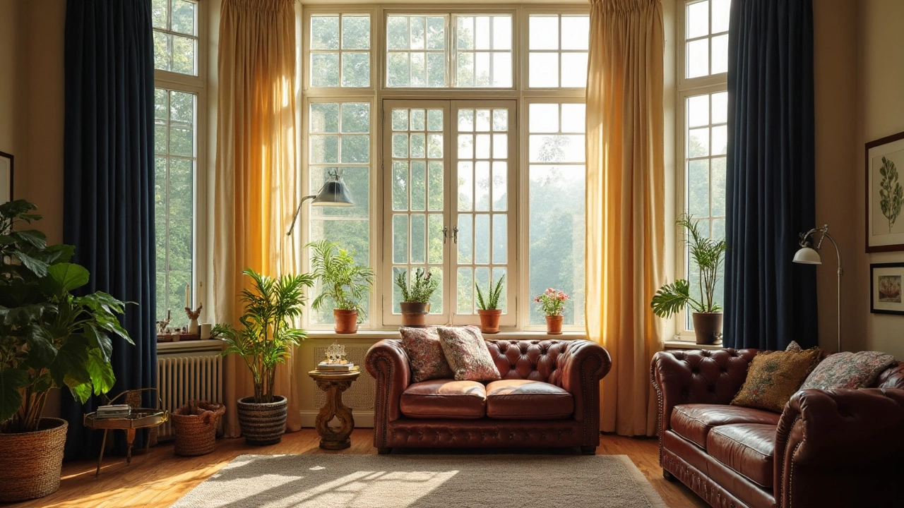
Going Lighter: What to Expect
Picking lighter curtains instantly makes any room feel bigger and more open. Light colors reflect natural light instead of soaking it up, which means your space looks airier. If you’ve got a small or north-facing room, this is probably the move—curtains that are a shade or two lighter than your walls can brighten things up and make ceilings look higher.
Lighter curtains are also more forgiving if you want your space to feel less “done up.” They quietly blend in, instead of standing out. This tends to work best with neutral wall colors like light gray, beige, or soft blue. But heads up: light curtains show dirt and stains a lot more, so families with pets or little kids might need to wash them more often.
Something most people don’t realize is that lighter curtains can’t block sunlight as well as dark ones. If you’re hoping to sleep past sunrise (or if your neighbor’s porch light is a whole situation), make sure you get lined or blackout versions. Some brands say their light-colored curtains block up to 95% of light with a blackout liner, so you don’t have to sacrifice function for style.
- Ideal for smaller or darker rooms—you get an instant boost in brightness.
- Blends in for a calm, less cluttered look, especially in minimalist or Scandinavian designs.
- Requires more frequent cleaning—dust, stains, and pet hair show up fast.
| Room Type | Best Light Curtain Benefit |
|---|---|
| Small Bedroom | Makes space look bigger |
| Living Room with Big Windows | Lets in lots of daylight |
| Basement Den | Helps cut the gloom |
One bonus: light-colored curtains don’t just look fresh. They also help on hot days by reflecting heat, keeping things cooler. If you’re in a spot where summer gets brutal, this can honestly save you a little bit on your cooling bill. Not huge money, but every bit counts. So, if you love a sun-filled room and don’t mind the occasional wash, lighter curtains are hard to beat.
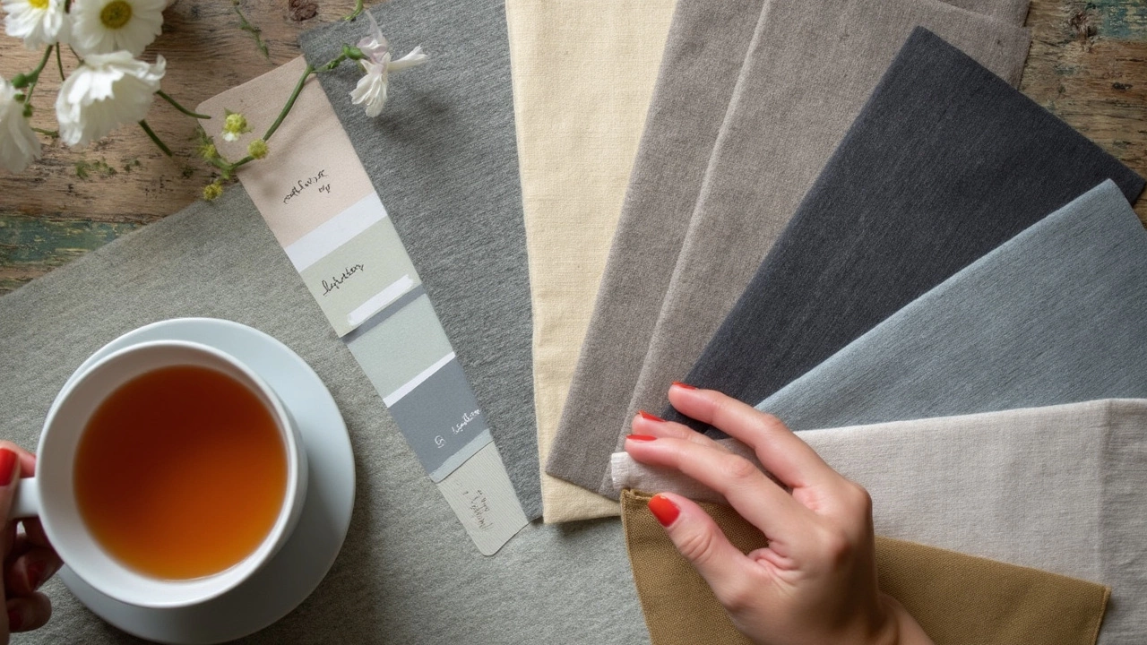
Creative Color Combinations That Work
Pairing curtain color with your walls can be intimidating, but there are a few tried-and-true combos that usually look great—without making your space feel off. Let’s break it down using some common wall shades.
If your walls are light gray, navy curtains add drama and depth. For beige or cream walls, olive green or rusty orange curtains can warm things up without clashing. Have white walls? You really can’t go wrong, but charcoal, mustard, or forest green curtains pop nicely and don’t show dirt as quickly (super practical if you have kids or pets).
For those who want to get a little bolder, patterned curtains featuring at least one color from your walls tie everything together, even if the main shade is totally different. For example, pale blue walls and floral curtains with blue in the pattern bring in personality without feeling random. It’s all about repeating at least one hue somewhere.
- Blue walls with sandy beige or crisp white curtains feel fresh and calming.
- Dark green walls with lighter taupe or cream curtains avoid making a room too heavy but keep things cozy.
- Try mustard yellow or burnt orange curtains against muted gray for a modern pop that isn’t full-on neon.
- If you love darker walls like deep navy or charcoal, try velvet blush or pale gray curtains so things don’t turn cave-like.
One neat fact: according to a 2023 home decor trends survey, nearly 60% of homeowners who updated their interior design in the last year chose curtains in a color contrasting their wall paint, not matching it exactly. This keeps spaces interesting but still coordinated.
Here’s a quick cheat sheet for common combos:
| Wall Color | Go-to Curtain Colors |
|---|---|
| Light Gray | Navy, mustard, charcoal |
| White | Charcoal, emerald, pattern prints |
| Beige/Cream | Olive, rust, teal |
| Blue | Beige, white, blush pink |
| Deep Green | Cream, taupe, floral prints |
Quick tip: If you’re renting and can’t paint, using curtain color is a sneaky way to change the whole mood of a room without breaking your lease or your budget.
Tips for Choosing the Right Shade
So, how do you actually land on the perfect curtain color for your space? It’s not as mystifying as Pinterest boards make it seem. There are tried-and-true tips to keep you from second-guessing every swatch. Here’s what to keep in mind when choosing the right shade for your curtains and getting your interior design vibe just right.
- Start with your walls and floor. The color of your walls gives you a big clue. If your room is already on the darker side, a shade that’s even darker will shrink the space—a good thing if you want it cozy, but risky in small rooms. For light walls, you can safely go a notch or two darker for your curtains to add some contrast without it looking off.
- Think about sunlight and direction. South and west-facing rooms get more sun, so you might not need super dark curtains unless you’re obsessed with blackout. In darker rooms, lighter curtain shades help bounce light and keep the space from feeling like a cave.
- Check the color in your real lighting. Swatches can lie. Hang the sample where you’ll actually use it. Look at it during the day and at night. Bulbs with a warm tone can turn cream curtains yellowish, while bright white bulbs can make soft grey curtains feel icy.
- Match, contrast, or coordinate with purpose. If you want a calm look, choose curtains close in shade to your wall color but a tiny bit darker or lighter. For a bold look, go with a high-contrast color, but anchor it somewhere else in the room (pillows, rugs, art) so it doesn’t feel random.
- Consider the practical stuff. Dark curtains show dust and pet hair more, and fade if you get strong afternoon sun. Lighter curtains need washing more often but hide fabric fading better. If allergies are a concern, avoid heavy blackout fabric since it traps dust.
To help, here’s a simple cheat sheet for curtain and wall color matching that decorators actually use:
| Wall Color | Best Curtain Options | Effect |
|---|---|---|
| White/Cream | Medium or Darker Shades | Bold, modern, or dramatic |
| Light Grey | Similar Grey (slightly darker/lighter) or Navy | Calm and balanced |
| Beige or Tan | Rich browns, olive, dusty blue | Warm and cozy |
| Bold Blue/Green | White, light grey, or soft patterns | Fresh, airy |
If you ever get stuck, snap a photo of your room and throw the colors into a free design app. Sometimes it’s easier to see what works—or doesn’t—before buying new home decor. And don’t forget: your taste matters more than any "rule" out there.