Tile Colors: Simple Tips to Pick the Right Shade
Choosing tile colors can feel like a puzzle, but it doesn’t have to be. The right hue can make a tiny bathroom feel spacious, turn a bland kitchen into a focal point, or add a cozy vibe to a living room. Below are practical steps you can follow right now, no design degree needed.
Start with the Room’s Purpose
Think about how you use the space. For high‑traffic areas like entryways, go for neutral tones—think soft greys, warm beiges, or classic whites. They hide dirt and wear well. If it’s a relaxing zone such as a bathroom or bedroom, cooler blues or muted greens can create a calm, spa‑like feel. Bright reds or yellows work great in a kitchen island or dining area where you want a pop of energy.
Match Tile to Light
Natural light dramatically changes how a color looks. In sunny rooms, dark tiles stay dark and can ground the space. In dim rooms, light tiles reflect what little light there is, making the area feel brighter. When you can, take a sample home and view it at different times of day. That quick test saves you from a costly redo later.
Another easy trick is to look at your existing palette. Pull out a pillow, a piece of artwork, or even a curtain you already love. Choose a tile shade that echoes one of those colors for a seamless look. If you love a teal accent wall, a teal‑gray tile can tie everything together without overwhelming the room.
Don’t forget size. Large tiles with subtle hues make small rooms appear bigger because there are fewer grout lines breaking up the view. Conversely, small mosaic tiles in a bold color can add texture and visual interest to a larger space.
When mixing colors, keep it simple: one dominant shade and one accent. For example, a light marble‑look tile paired with a charcoal grout creates depth without clashing. If you’re adventurous, try a two‑tone layout—like a border of darker tiles around a light center—to frame the area.
Current trends lean toward earthy tones—terracotta, olive, and warm sand. These colors blend well with natural wood furniture and brass fixtures, giving a modern yet timeless vibe. If you prefer a sleek look, consider matte black or charcoal tiles paired with crisp white fixtures for high contrast.
Before you buy, budget for installation. Some colors, like deep blues or rich reds, may require more precise cutting to avoid visible joints, so factor in labor costs. Ask your installer for a mock‑up; most will gladly lay a few squares so you can see the final effect.
Finally, maintain your tiles. Light colors show stains, so choose a sealant if you expect spills. Dark tiles hide grime but can look dull without proper cleaning. A quick wipe with a pH‑balanced cleaner keeps any hue looking fresh.
Pick a tile color that feels right for you, test it in real light, and think about how it works with the room’s purpose. Follow these steps and you’ll end up with floors or walls that not only look great but also fit your everyday life.
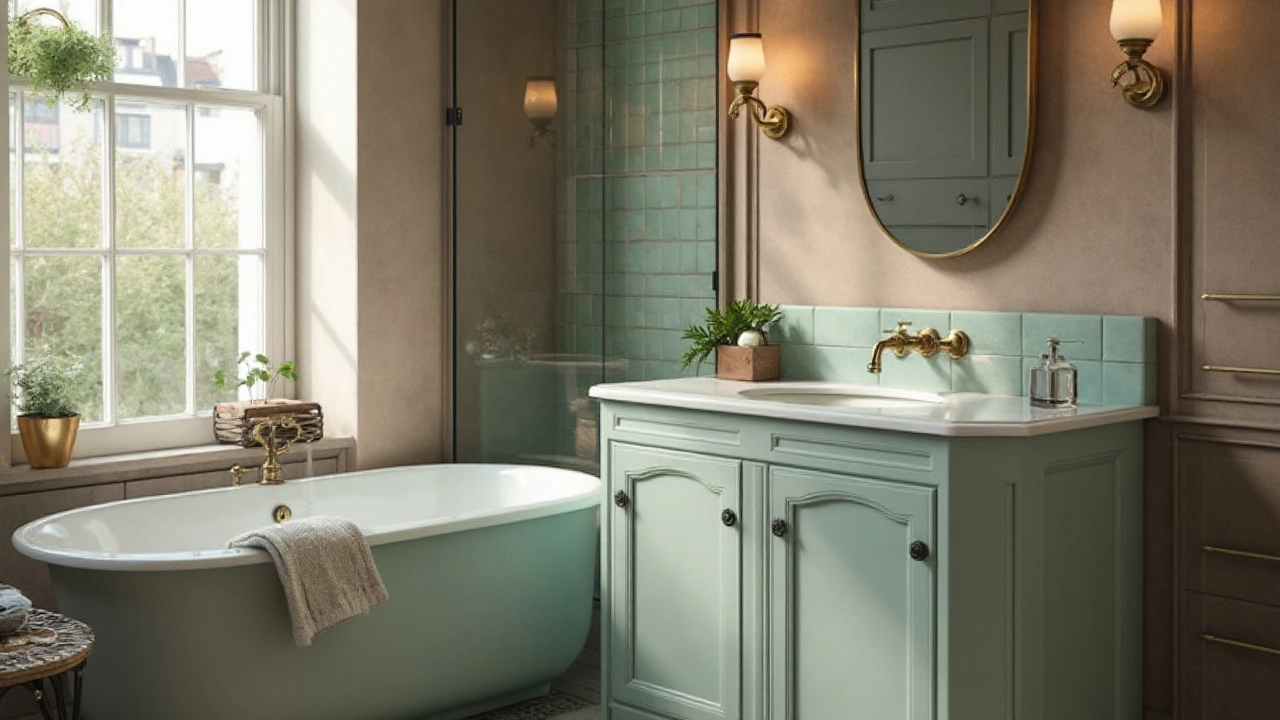
2024 Bathroom Color Trends: Warm Neutrals, Sage Greens, and Soft Blues
Warm neutrals, sage greens, and soft blues defined 2024 bathrooms. See real palettes, tile and material pairings, fixture finishes, and quick formulas you can copy.
Categories
- Storage (30)
- Sofas (23)
- Bathroom (21)
- Curtains (16)
- Kitchenware (13)
- Rugs (13)
- Cushions (13)
- Mirrors (13)
- Home Decor (12)
- Bedding (12)
Popular Articles
Choosing the Perfect Curtain Color for White Walls
Jan, 27 2025