2024 Bathroom Color Trends: Warm Neutrals, Sage Greens, and Soft Blues
Greys took a step back in 2024 bathrooms. Warmer, nature-led palettes moved in-think putty, clay, sage, and soft blue-with stone textures and soft metallics doing the heavy lifting. If you’re after the short answer to what actually trended, it’s this: calm, sun-warmed colour that feels like a spa, not a showroom.
Bathroom color trend 2024 is a design direction centred on warm neutrals (putty, sand, oatmeal), green tones (sage, olive), and airy blues (mist, slate), paired with natural stone (travertine, terrazzo), textured tiles (zellige), timber vanities, and soft metallics (brushed brass, nickel). The look is low-contrast, tactile, and nature-inspired.
TL;DR
- Warm, earthy neutrals, sage greens, and soft blues led 2024 bathroom palettes; greys cooled off.
- Textures mattered: travertine, terrazzo, and zellige tiles made the colours feel richer.
- Finishes skewed soft: brushed brass and nickel over shiny chrome; matte black as a crisp accent.
- Evidence lined up across reports from the NKBA, Pantone, Dulux, and (in NZ) Resene.
- Copy the look with one colour family, one texture hero, one metal, and one accent-done.
What actually trended in 2024 bathrooms
Three palettes did the heavy lifting: warm neutrals (putty, biscotti, mushroom), greens (sage, eucalyptus, olive), and soft blues (mist, horizon, slate). White didn’t vanish, but it softened-more cream than crisp. Contrast dialled down: instead of black-and-white, we saw tone-on-tone layers that felt spa-like and forgiving in real light.
Industry signals backed this shift. Pantone is a colour standardization system known for its annual Color of the Year; 2024’s pick, Peach Fuzz (13-1023), highlighted a warm, comforting vibe that spilled into bathroom accents and textiles. National Kitchen & Bath Association (NKBA) is a US-based industry association that publishes design trends; its 2024 report pointed to nature-forward palettes-greens, blues, and warm neutrals-gaining share in bathrooms.
Paint leaders echoed it. Dulux is a global paint brand; its 2024 Colour of the Year, Sweet Embrace, is a soft blush that paired well with warm stones and brushed metals in bathroom schemes. And here in Aotearoa, Resene is a New Zealand paint company; its 2024 palette emphasised grounded neutrals and herbal greens suited to coastal light and smaller rooms.
The bigger design current underneath? Biophilic design is a design approach that connects interiors to nature through colour, material, light, and plant life; in bathrooms, it drove the move to greens, stone, timber, and diffuse lighting.
The colour families that led the year
Here’s how the three leading families behaved, and how people actually used them at home.
Warm neutrals
Putty, sand, oatmeal, and greige-with-warmth were everywhere. They flatter skin tones (nice for mirrors), hide water spots better than stark white, and work with almost any metal. In Auckland villas where bathrooms are compact, these hues keep things calm without feeling cold. Pair with travertine-look tile, timber fronts, and brushed brass for a toasty, European spa vibe.
Travertine is a beige-to-honey limestone with linear veining and small pits; in bathrooms it reads warm and organic, softening modern fixtures. A porcelain travertine-look tile gets you the look with easier care.
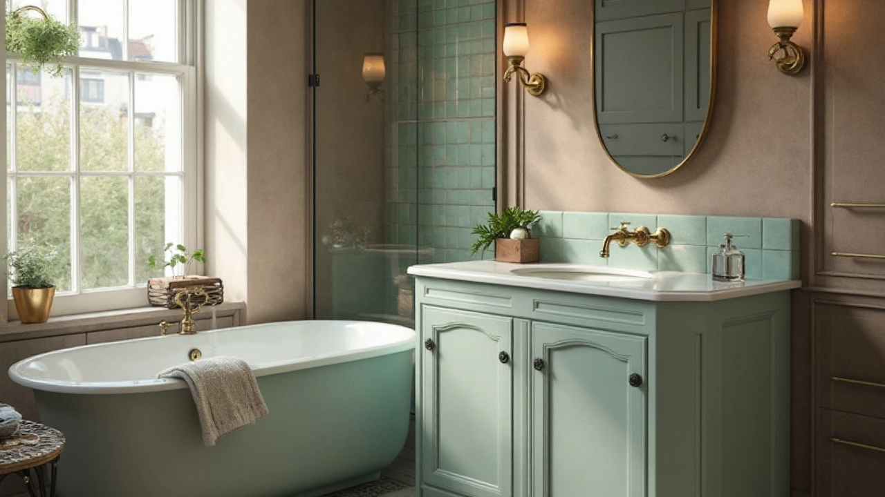
Greens: sage to olive
Sage walls with lighter tile floors took off in 2024. It’s calming without being sweet, and it loves natural light. Olive showed up on vanities or shower niches for depth. These greens sing with warm whites, biscuit tile, and brass or brushed nickel. If your room is south-facing and cool, pick a green with a yellow undertone to avoid going grey.
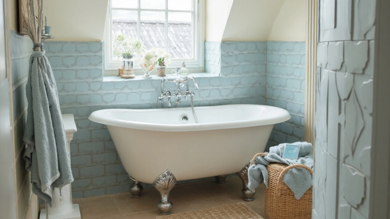
Soft blues
Mist and horizon blues gave bathrooms that coastal, bright air many of us want. They’re especially good in narrow rooms-blue recedes and visually widens. Blues pair with light oak, white zellige tiles, and polished nickel for a crisp-but-soft look. In low light, choose blues with a drop of green to keep them from feeling chilly.
Texture made the colours
Even the nicest paint falls flat without texture. That’s where tile and stone turned trends into rooms you want to touch.
Zellige is a handmade Moroccan tile, often 100×100 mm, with rippled glaze and colour variation; it adds depth and sparkle to low-contrast palettes. It kept simple colours alive-especially in white, cream, and soft green. Terrazzo joined in for a playful speckle effect in neutrals and muted pastels. Microcement wrapped vanities and shower walls for a seamless, modern shell that takes warm hues beautifully.
Metal finishes mattered. Brushed brass warmed neutral and green rooms; brushed nickel cooled blues softly; matte black punctuated pale palettes without looking stark. If you swap only one thing to get the 2024 look, swap chrome for a softer finish.
How to choose (and not regret it)
Here’s a quick, no-drama process that works in rentals or full renos.
- Pick your family: warm neutral, green, or soft blue. Say it out loud. Done.
- Match undertone to light: if the room is cool/dim, go warmer; if it’s bright/warm, you can go cooler.
- Choose one hero texture: travertine/terrazzo/zellige/microcement. Keep the rest quiet.
- Pick one metal: brushed brass for warmth, brushed nickel for cool elegance, matte black for punch.
- Test big swatches at eye level, two coats. Check morning, noon, and evening.
- Commit to a grout colour that supports the paint, not fights it (warm white or light taupe for beige; light grey for blue; mushroom for sage).
Live in a classic kiwi bungalow with a tiny bathroom? Lean warm and low-contrast. Small rooms love a seamless envelope-take the wall colour onto the ceiling and use one floor tile throughout to stretch the space.
Comparison: 2024 bathroom colour families at a glance
| Colour family | Typical undertone | Best with | Lighting sweet spot | Common pitfalls | Good grout |
|---|---|---|---|---|---|
| Warm neutrals | Yellow/Red (putty, biscuit) | Travertine, oak, brushed brass | Cool or dim rooms | Too much cream can look dated without texture | Warm white, light taupe |
| Sage/olive greens | Yellow/Green (herbal) | Zellige, timber, brass or brushed nickel | Any; pick warmer in cool rooms | Blue-leaning greens can go cold in shade | Mushroom, stone beige |
| Soft blues | Green/Gray (misty) | Polished nickel, white tiles, light oak | Bright or warm rooms | Pure grey-blues can feel clinical | Cool white, pale grey |
Quick colour formulas to copy
These combos are low-risk and feel very 2024.
- Warm neutral spa: Biscuit wall paint + porcelain travertine floor + timber vanity + brushed brass tapware + cream zellige splashback.
- Sage calm: Soft sage wall + warm white subway tile + oak vanity + brushed nickel tapware + mushroom grout.
- Coastal blue: Misty blue wall + white zellige shower + light oak + polished nickel + soft grey grout.
- Earthy contrast: Clay-taupe wall + terrazzo floor with warm chips + matte black tapware + linen-toned towels.
If you’re choosing paint locally, Dulux NZ and Resene have easy neutrals. Dulux types: warm whites and biscuity neutrals sit well with our bright coastal light. Resene standbys like Sea Fog (soft warm white) and Tea (classic warm greige) often behave beautifully in Auckland bathrooms without skewing green or pink.
Evidence and why it stuck
Why did these colours win? Anxiety was high, and people wanted rooms that exhale. Peach Fuzz from Pantone underscored a shift to softness. The NKBA design trends report flagged more organic palettes and materials, and bathroom product launches followed suit-more brushed, fewer mirrorshine finishes; more honed stone; more textured tile.
Dulux’s 2024 forecast leaned into warmth (Sweet Embrace), while Resene’s New Zealand releases focused on grounded neutrals and greens that handle strong daylight. All roads led to the same place: calmer colour, richer texture, kinder light.
Fixtures, finishes, and undertone rules
Colour is only half the picture. Finishes can make a palette sing-or clash.
- Brushed brass: warms neutrals and greens; choose “brushed/satin” not “polished” to avoid glare.
- Brushed nickel: loves blues and cool whites; it’s softer than chrome and hides water spots better.
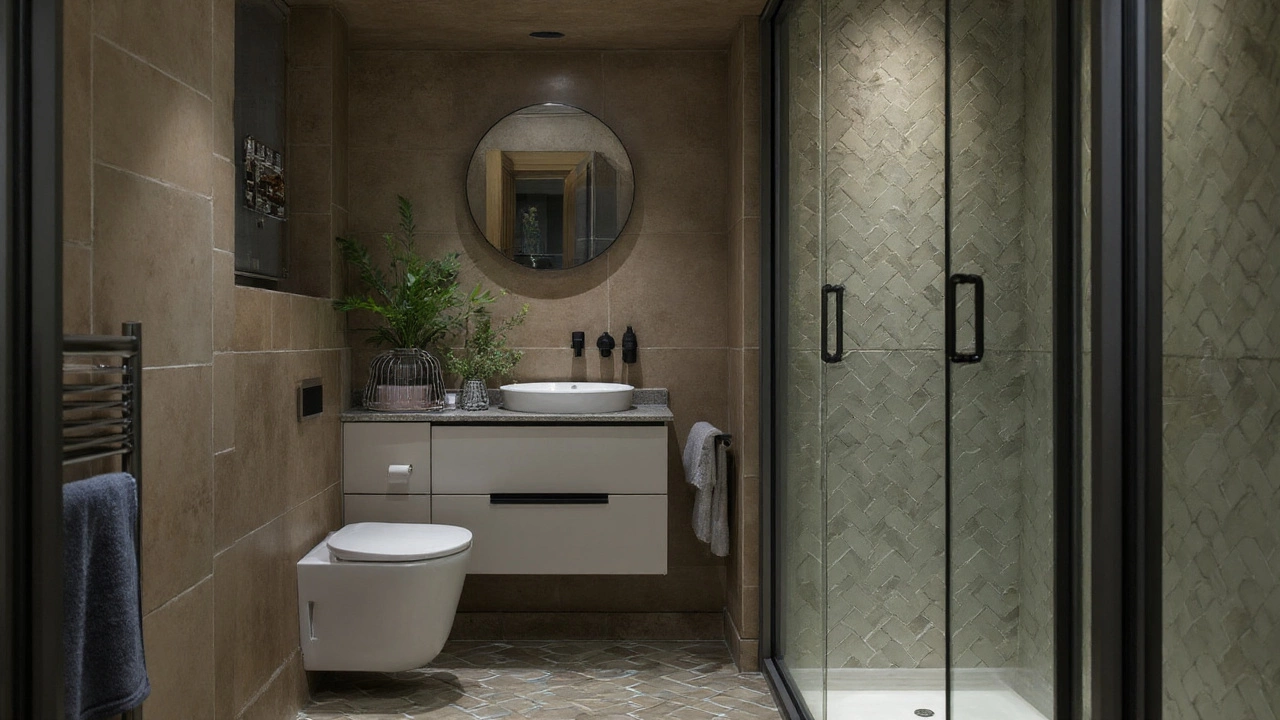
- Matte black: great as punctuation with pale palettes; limit to one or two elements so it doesn’t chop up small rooms.
- Honed stone: reads warmer and more relaxed than polished; less reflection equals deeper colour.
- Sheen levels: in humid rooms, use low-sheen or semi-gloss on walls rated for bathrooms; ceiling flat to hide steam ripples.
Small bathrooms, rentals, and budget moves
In tight spaces, lower contrast. Take wall colour onto the ceiling, keep the floor continuous, and use a light, warm neutral to make corners melt away. Add a single vertical strip of texture (zellige or ribbed tile) behind the vanity for life without clutter.
Renting? Paint just the vanity in sage or clay, swap chrome handles for brushed brass, then layer towels in the same undertone. Peel-and-stick tile around mirrors adds texture with zero grout.
Regional note for New Zealand homes
Auckland’s coastal light can be sharp at midday. Swatches that look creamy indoors may swing yellow in full sun. Test on the brightest wall and the shadiest corner. In south-facing rooms, choose greens with a yellow base and neutrals with a touch of red to keep things warm. High humidity? Prioritise bathroom-rated paints and good extraction-colour reads better on dry walls.
Related concepts
This topic sits inside interior colour strategy and bathroom material selection. If you want to go deeper, look at sustainable coatings, lighting temperature (2700K vs 3000K), grout maintenance, and universal design for aging in place-each changes how a colour reads and performs day to day.
Checklist: lock in your palette in 20 minutes
- Choose 1 family: warm neutral, green, or blue.
- Pick 1 hero texture: travertine, terrazzo, zellige, or microcement.
- Select 1 metal: brass, nickel, or matte black.
- Match grout to undertone (warm, cool, or neutral).
- Get two large sample pots and paint A4 sheets; move them around.
- Stand in your bathroom at morning and evening-keep the swatch that still looks good both times.
If you remember nothing else, remember this phrase: bathroom color trends 2024 equals warm, nature-led colour with soft finishes and tactile tile.
Next steps and troubleshooting
- My room went green/pink overnight: that’s undertone clashing with light. Shift one notch warmer or cooler in the same family.
- Tile looks dirty with my paint: your grout undertone is fighting. Nudge grout warmer (taupe) with warm schemes; cooler (grey) with blues.
- Everything looks flat: you need texture. Add ribbed or zellige tile on a feature strip, or swap to honed stone.
- Metal finish feels wrong: brass too yellow? Try brushed nickel. Black too stark? Use it only on the mirror frame.
- Still nervous: paint the vanity first; live with it a week; then commit to walls.
Frequently Asked Questions
What is the single biggest bathroom colour trend of 2024?
Warm, nature-inspired palettes led the year-especially putty and biscuit neutrals, sage greens, and misty blues-layered with tactile materials like travertine and zellige. The look is soft, low-contrast, and soothing rather than stark.
Did grey go out of style in 2024 bathrooms?
Cool greys cooled off. Designers shifted to warmer greige, putty, and clay. If you love grey, keep it warm and textured-think honed stone, not glossy porcelain-so it feels current, not chilly.
Which metal finish works best with sage green?
Brushed brass for warmth or brushed nickel for a soft, cool pairing. Brass adds glow; nickel keeps it calm. Avoid high-polish chrome if you’re chasing that relaxed 2024 feel.
How do I choose grout so the colour scheme looks intentional?
Match undertone, not just lightness. Warm neutrals love warm white or taupe grout; greens like mushroom; blues prefer cool white or light grey. If in doubt, go one shade darker than the tile-it hides grime and frames the texture softly.
What paint sheen should I use in a bathroom?
Use bathroom-rated low-sheen or semi-gloss on walls for washability and moisture resistance, and flat on ceilings to hide steam ripples. Avoid high-gloss unless the room has perfect walls-it can spotlight flaws.
Is Pantone’s 2024 Peach Fuzz usable in a bathroom?
Yes, as an accent. It’s gorgeous in towels, art, or a vanity paint pop, especially with travertine and brushed brass. For walls, keep it pale or balance with plenty of warm white tile so it doesn’t read too sweet.
What if my bathroom has no natural light?
Shift warmer and lighter. Warm neutrals or yellow-leaning sage keep things cosy. Use 3000K LED lighting (not blue-white) and add texture-zellige or ribbed tile-to avoid a flat, artificial look.
Are these 2024 colours still relevant now?
Yes. Warm naturals and soft botanicals age well because they’re rooted in material reality-stone, timber, daylight. If you want longevity, keep contrast low, lean on texture, and choose one metal finish you can carry through accessories.
Entity notes (first mention definitions above): Pantone (Color of the Year 2024: Peach Fuzz), National Kitchen & Bath Association (2024 design trends), Dulux (Sweet Embrace palette), Resene (NZ palette focus), Biophilic design (nature-led interiors), Travertine (warm limestone), Zellige (textured tile).