What Colors Make a Bathroom Look Expensive? Expert Picks That Actually Work
Bathroom Color Mood Calculator
Your Luxury Color Recommendation
Based on your selections, these colors create a high-end bathroom without major renovations:
Primary Color
Accent Color
Metallic Touch
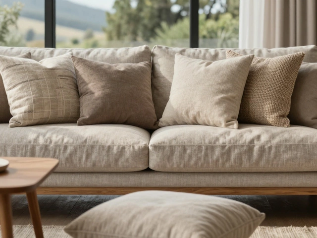
Why this works: Revere Pewter creates depth in medium bathrooms with mixed lighting while reflecting warmth. Paired with Seafoam Green trim, it mimics natural elements for spa-like serenity. Brushed brass fixtures add luxury without overwhelming the scheme.
Pro Tip
For your space, use matte finish tiles to avoid looking cheap. Add a dimmer switch to maintain luxury with soft lighting after dark.
Want your bathroom to look like it cost ten times more than it did? It’s not about the price tag-it’s about the palette. The right colors can turn a basic bathroom into a spa-like retreat that feels custom-designed and effortlessly luxurious. You don’t need marble countertops or gold fixtures to pull it off. Just the right shades, applied with intention, do the heavy lifting.
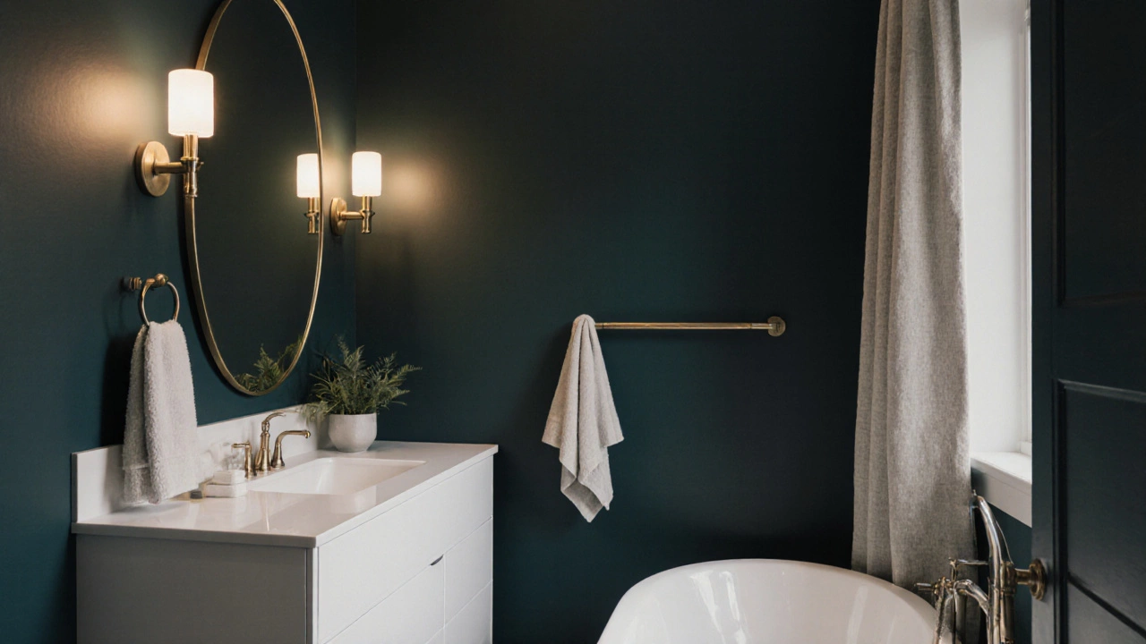
Dark, Moody Tones Create Instant Depth
For years, white bathrooms were the go-to for a clean, airy feel. But if you want to signal luxury, go darker. Deep charcoal, navy, or even black walls don’t make a bathroom feel smaller-they make it feel intimate, rich, and intentional. Think of it like a well-tailored suit: the color wraps around you, creating a sense of quiet opulence.
In Auckland homes, dark bathrooms are popping up more often, especially in renovated period homes. One client painted her ensuite in Farrow & Ball’s Dead Salmon-a muted, dusty rose-gray-and paired it with brushed brass taps and a freestanding tub. The result? Guests assumed the renovation cost $50K. It was under $18K.
Why does this work? Dark colors absorb light instead of reflecting it. That creates contrast, which draws the eye to details: the curve of the faucet, the texture of the tile, the sheen of a towel bar. It’s not about being dark-it’s about being deliberate.
Warm Neutrals Are the Secret Weapon
White can feel cold. Off-white? Even worse if it’s too sterile. The trick is to choose neutrals with warmth baked in. Think beige with a hint of terracotta, cream with a touch of yellow, or greige (gray + beige) with a soft brown undertone.
Benjamin Moore’s White Dove and Sherwin-Williams’ Alabaster are popular, but they often look flat under bathroom lighting. Try Revere Pewter instead-a grayed taupe that reads as soft, not gray. It works with both warm and cool metals, and it doesn’t wash out under fluorescent bulbs.
One homeowner in Ponsonby swapped her stark white tiles for Navajo White on the walls and kept the floor tile in a warm, honey-toned limestone. The bathroom now looks like it was designed by a boutique hotel stylist. No expensive upgrades needed.
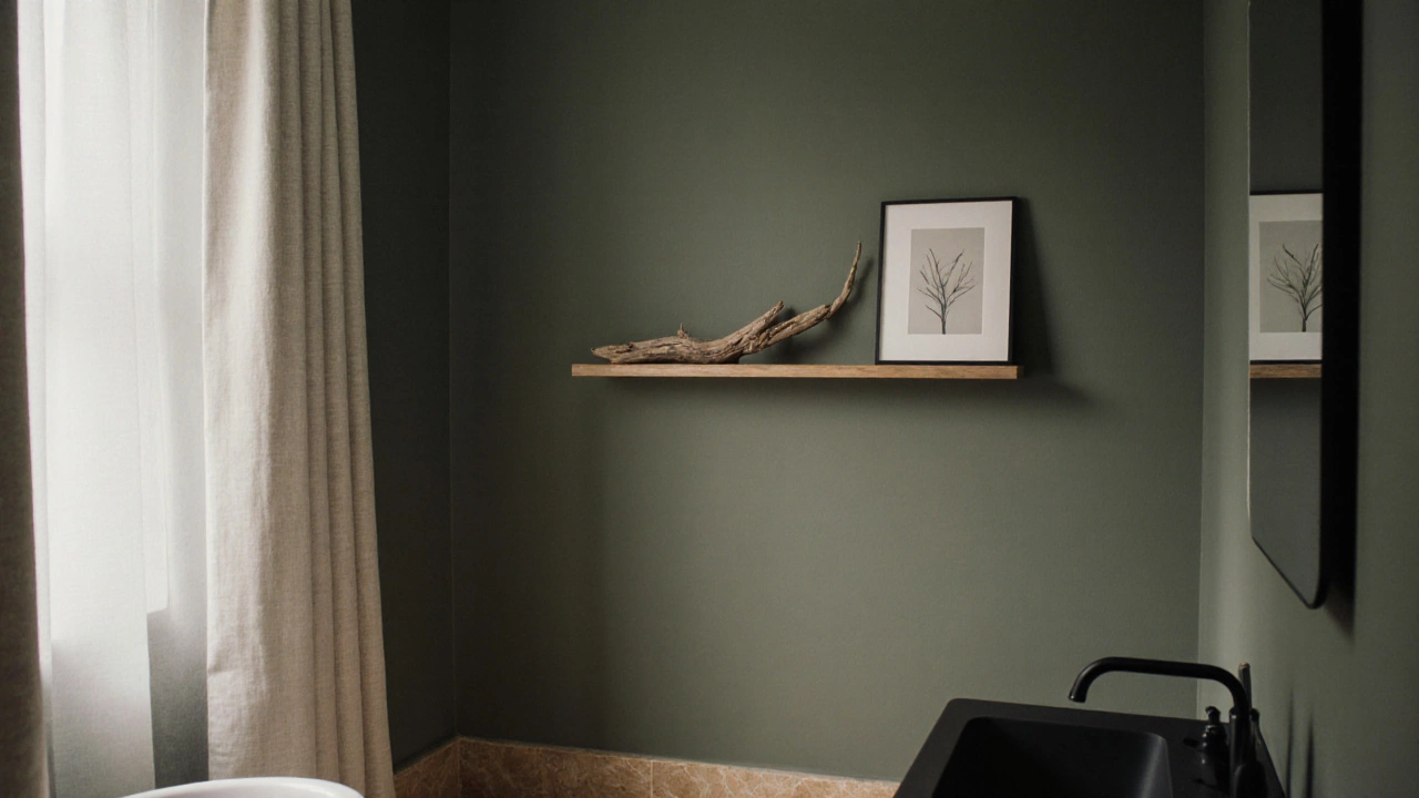
Soft Greens and Blues Bring Spa Energy
There’s a reason luxury spas use green and blue: they’re calming, natural, and feel expensive without shouting. Sage green, seafoam, and muted teal all mimic water, stone, and foliage-elements that feel inherently serene and high-end.
Try Farrow & Ball’s Green Smoke on the walls. It’s not a bold green-it’s a foggy, grayed green that feels like a misty morning. Pair it with matte black fixtures and a single piece of driftwood art. Instant spa.
Blue works the same way. Don’t go for bright cobalt. Go for Benjamin Moore’s Hale Navy on the vanity wall, or Softened Green from Sherwin-Williams. These aren’t colors you notice immediately-they’re colors you feel.
Black and White? Yes, But Not Like You Think
Classic black-and-white bathrooms never go out of style. But the luxury version isn’t the high-contrast checkerboard from the 1980s. It’s about balance and texture.
Use white for large surfaces-walls, ceilings, large tiles-and black for accents: the frame around a mirror, the legs of a vanity, the grout lines between subway tiles. One designer in Wellington used black grout on white 3x6 subway tiles. The result? The tiles look like they’re floating, and the space feels curated, not cheap.
Also, avoid glossy white tiles. They show every smudge. Matte or honed finishes look more expensive because they’re harder to maintain-so they feel more intentional.
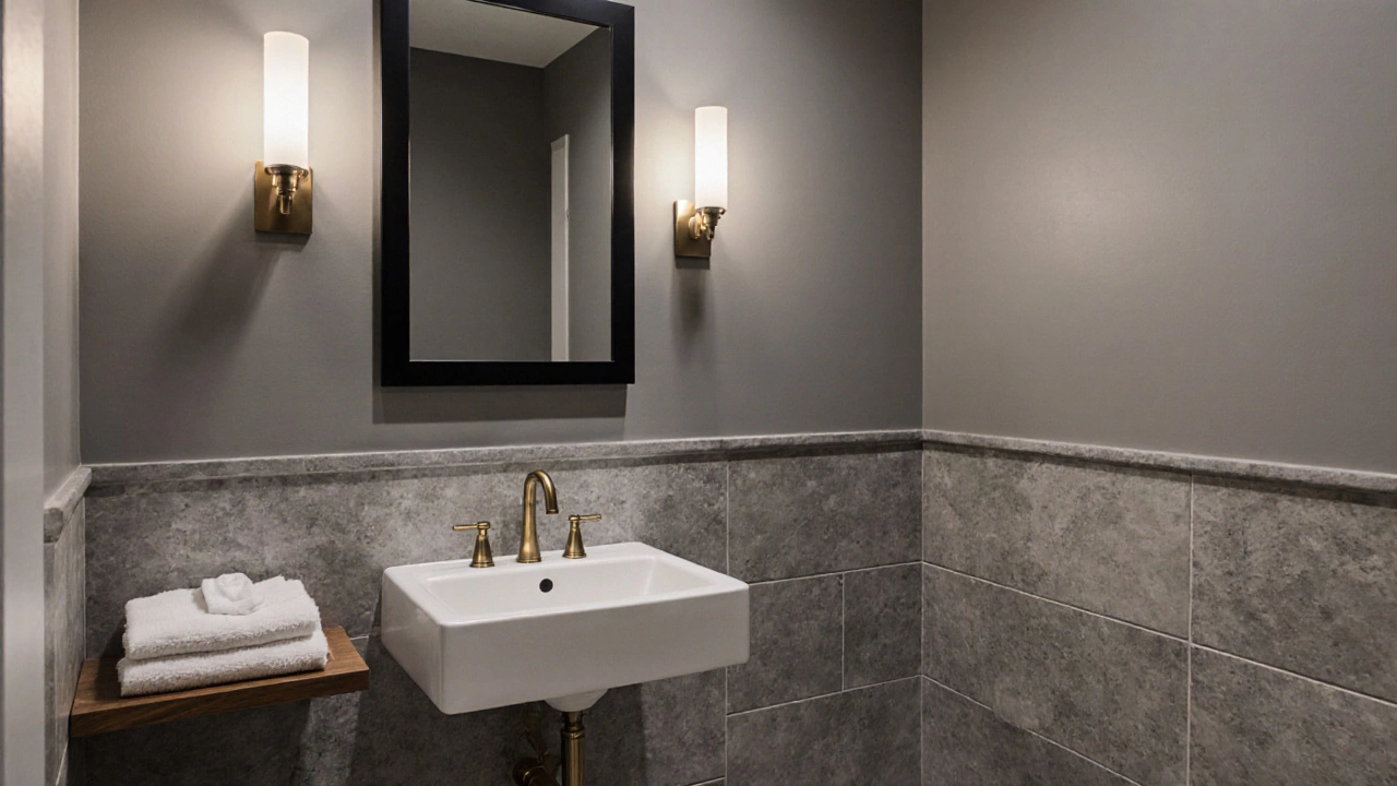
Gold, Brass, and Bronze: The Metallic Touch
Metals aren’t colors, but they’re part of the color story. Warm metals-brushed brass, antique bronze, oil-rubbed copper-tie dark and neutral tones together. They add warmth and reflect light in a soft, flattering way.
Forget chrome. It’s functional, not luxurious. Chrome looks like a rental apartment. Brass looks like a boutique hotel. Even a single brass towel ring or a brass-framed mirror can elevate the whole room.
One rule: if you’re using warm wall colors, stick to warm metals. If your walls are cool (like gray or green), you can mix in a touch of brushed nickel-but keep it minimal. Too many metals feel cluttered.
What Colors to Avoid
Not every color screams luxury. Some actually scream “budget renovation.”
- Bright yellow-even pale yellow-feels dated and cheap in bathrooms. It’s the color of cleaning products.
- Pink (especially hot or pastel pink) is still tied to 90s bathrooms. Unless it’s a deep, moody rose like Dead Salmon, skip it.
- Neon or fluorescent tones-no exceptions. They’re not luxurious. They’re a hazard.
- Too many colors-if you’re using more than three main colors (including accent tones), you’re overdoing it. Luxury is restraint.
Real Examples That Work
Here are three real bathroom makeovers-no contractors, no major plumbing, just paint and accessories:
- Small Powder Room, Newmarket: Walls painted in Sherwin-Williams’ Agreeable Gray, floor in large-format matte porcelain with a stone look, brass faucet, black mirror. Cost: $3,200. Looks like a $20K design.
- Master Ensuite, Takapuna: Navy walls (Benjamin Moore’s Windsor Green), white vanity, black towel bars, linen curtains. No tile change. Lighting upgraded to warm LEDs. Cost: $4,500. Now feels like a five-star hotel.
- Guest Bathroom, Devonport: White walls with sage green trim on the vanity, natural wood shelf, black matte fixtures, white cotton towels. No new tiles. Just paint, a mirror, and good lighting. Cost: $1,800. Guests ask for the designer’s name.
Lighting Is Part of the Color Story
You can pick the perfect color, but if your lighting is cold and harsh, it’ll ruin the vibe. Always use LED bulbs with a color temperature of 2700K to 3000K. That’s warm white-not yellow, not blue.
Layer your lighting: overhead for function, sconces on either side of the mirror for flattering skin tones, and a dimmer switch so you can lower the light at night. A bathroom with soft, layered light feels more expensive than one with bright, single-source lighting-even if the tiles are identical.
Final Tip: Less Is More
The most expensive-looking bathrooms aren’t the ones with the most stuff. They’re the ones with the least clutter. One towel folded neatly on a wooden rack. A single plant. A soap dispenser that matches the faucet. That’s it.
Color sets the tone. But restraint makes it feel luxurious. Choose one or two colors you love, stick to warm metals, add soft lighting, and keep the counters clear. That’s how you make a bathroom look expensive-without spending a fortune.
Can I use white in a luxury bathroom?
Yes-but not plain white. Use warm whites like Benjamin Moore’s White Dove or Sherwin-Williams’ Alabaster. Avoid icy or blue-tinged whites, which look cold and clinical. Pair them with warm metals and textured materials to add depth.
Do dark colors make a small bathroom feel smaller?
Not if you do it right. Dark walls create depth and draw attention upward. Use light-colored ceilings, good lighting, and reflective surfaces like mirrors or glossy tiles to balance the darkness. In small bathrooms, dark colors can actually make the space feel more intimate and cozy-not cramped.
What’s the best color for a bathroom with no natural light?
Go for warm neutrals like Revere Pewter or Agreeable Gray. These tones reflect artificial light softly and don’t feel dull under LEDs. Avoid cool grays or pure whites-they’ll make the space feel flat and lifeless. Add layered lighting and a mirror to bounce light around.
Is it okay to mix metal finishes in a bathroom?
Yes-but keep it simple. Stick to one dominant metal (like brushed brass) and add a second only as an accent (like a black faucet or chrome towel bar). Too many metals look messy. Luxury is about harmony, not variety.
What’s the cheapest way to make a bathroom look expensive?
Paint the walls a rich, moody color, swap out hardware for warm metal finishes, install a dimmer switch, and add a few high-quality textiles like thick cotton towels and a woven mat. That’s it. You don’t need new tiles or a new tub.
Next Steps
Start by picking one wall to paint. Test two colors side by side with sample pots. Live with them for a few days under different lighting. See how they feel in the morning and at night. Then, match your fixtures and towels to that tone.
Don’t rush. The most expensive-looking bathrooms are the ones that feel calm, collected, and thoughtfully put together. Color is your most powerful tool-and it’s the one thing you can change without a permit, a contractor, or a huge budget.