What Color Is Most Flattering in a Bathroom? The Ultimate Guide to Bathrooms That Feel Luxurious
Bathroom Color & Skin Tone Matcher
Step 1: Select Your Skin Tone
Choose the category that best describes your complexion.
Step 2: Lighting Condition
Your Personal Palette
Select your skin tone and click calculate to see recommended colors.
Have you ever walked into a bathroom that felt instantly relaxing, only to leave feeling drained or unflattered by your own reflection? It’s not just about the cleanliness of the space. It’s about the bathroom colors you choose. The right palette doesn’t just look good on Instagram; it affects how your skin looks, how spacious the room feels, and even your mood before you start your day. Getting this wrong can make a bright morning routine feel gloomy, while getting it right turns a small utility room into a personal spa.
The Psychology of Color in Small Spaces
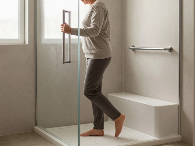
Bathrooms are often the smallest rooms in the house, yet they demand high performance. You’re standing there looking at yourself, applying makeup, or shaving. The walls aren't just background noise; they are active participants in your daily ritual. Dark, heavy colors like deep charcoal or navy can create a cozy, intimate vibe, but if the lighting isn’t perfect, they can shrink the space and cast shadows on your face that make you look tired. On the other hand, stark white is classic, but without warmth, it can feel clinical and unforgiving, highlighting every flaw.
The most flattering colors strike a balance between contrast and harmony. They need to reflect enough light to brighten your complexion without washing you out. Think of these tones as a soft filter for your life. A warm greige (a mix of gray and beige) offers neutrality with a hint of warmth, making skin tones look healthier. Soft greens, reminiscent of sage or seafoam, have been shown in environmental psychology studies to lower heart rates and reduce stress, which is exactly what you want when you’re rushing to get ready.
Lighting: The Silent Partner to Your Paint Choice
You cannot separate color from light. In fact, lighting dictates whether a color is flattering or flat. Most bathrooms rely on a combination of artificial overhead lights and natural window light. If your bathroom has north-facing windows, the natural light will be cool and bluish. Painting those walls a cool gray might make the room feel icy and sterile. Instead, you’d want a warm off-white or a creamy yellow to counteract the blue cast and keep your skin tone looking vibrant.
Artificial lighting plays an even bigger role. Standard incandescent bulbs (now largely replaced by LEDs) emitted a warm, yellowish glow. Modern LED bulbs vary widely in "color temperature," measured in Kelvins. A 3000K bulb gives a warm, inviting light, while a 5000K bulb mimics harsh daylight. If you choose a bold wall color like terracotta or mustard, pair it with 3000K-3500K lighting to enhance the richness. If you go with crisp whites or light blues, a 4000K neutral light keeps the space feeling clean and alert. Always test your paint swatches under the actual bathroom lighting at different times of the day before committing.
Top Flattering Colors for Every Skin Tone
One size does not fit all when it comes to skin tones. The goal is to find a wall color that complements your complexion rather than competing with it. Here is how to match your bathroom palette to your needs:
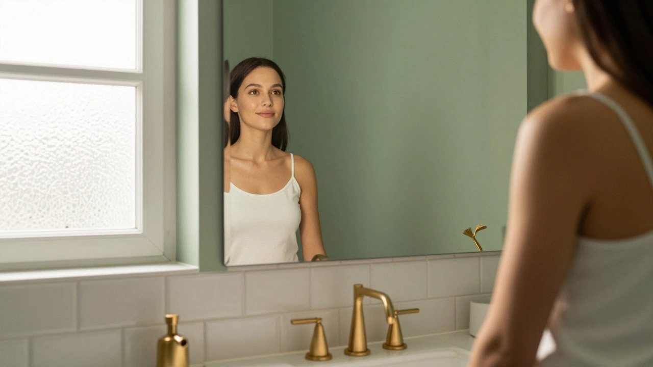
- Fair Skin Tones: Avoid pale pastels that are too close to your skin tone, as they can make you look washed out. Instead, opt for medium-depth colors like dusty rose, soft lavender, or muted teal. These provide enough contrast to define your features without being overwhelming.
- Mediterranean/Olive Skin Tones: Warm earth tones work beautifully here. Think terracotta, olive green, or warm beige. These colors echo the natural warmth in your skin, creating a harmonious and glowing effect. Avoid cool, ashy grays which can clash with your undertones.
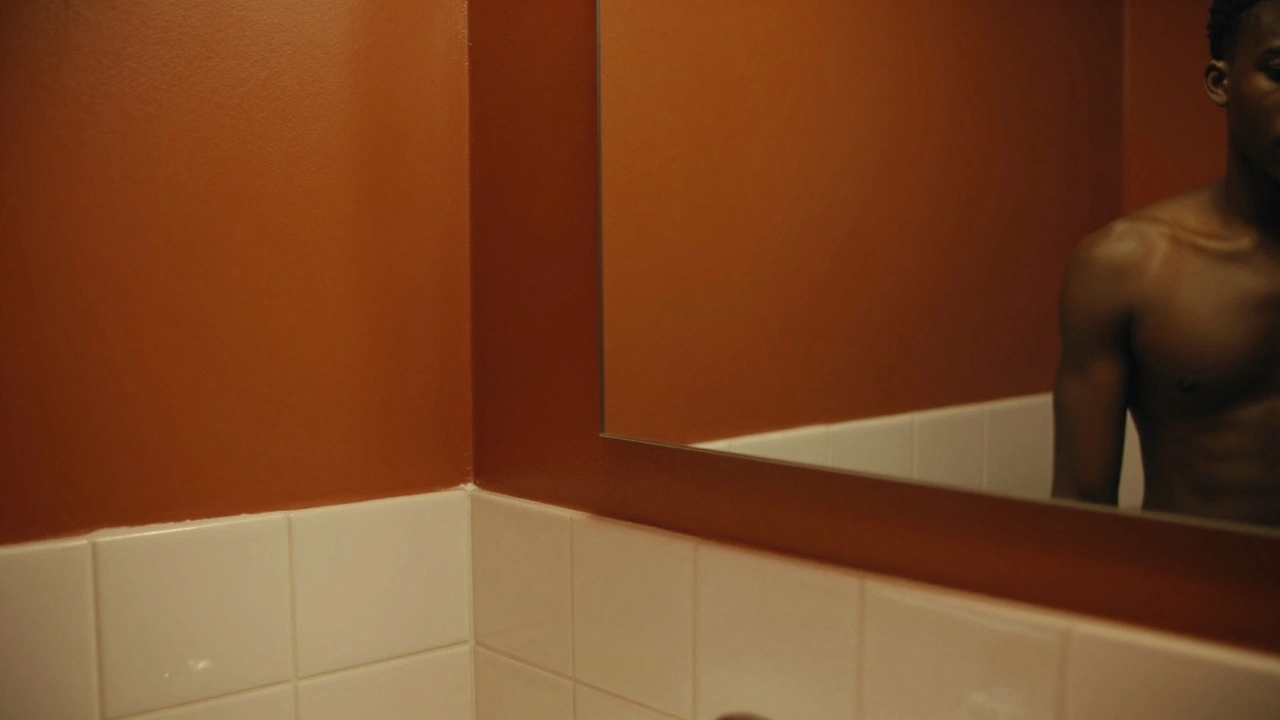
- Deep/Dark Skin Tones: You can pull off bold, rich colors that might overwhelm others. Deep emerald green, royal blue, or even black accents against lighter walls look stunning. For a more subtle approach, warm creams and golds highlight the richness of your skin tone beautifully.
| Color Family | Best For | Why It Works |
|---|---|---|
| Warm Whites & Creams | Small spaces, all skin tones | Reflects light evenly, prevents shadows, feels clean but not clinical. |
| Sage Green | Relaxation, morning routines | Natural association with calmness; complements both warm and cool undertones. |
| Dusty Blue | Spa-like atmosphere | Cooling effect that reduces visual clutter; pairs well with wood accents. |
| Terracotta/Burnt Orange | Energy, modern aesthetics | Adds warmth and depth; makes fair skin look radiant through contrast. |
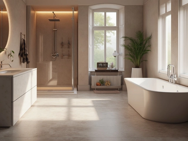
Material Matters: Beyond Just Paint
Your walls are only part of the equation. The materials you choose for fixtures, tiles, and accessories interact with the wall color to create the final impression. White subway tiles paired with a sage green wall create a fresh, airy look. However, if you pair that same green with dark slate tile, the mood shifts to something much heavier and more dramatic.
Consider the finish of your surfaces. Glossy tiles reflect light, bouncing it around the room and amplifying the brightness of your wall color. Matte finishes absorb light, which can deepen the color and make the space feel cozier but smaller. If you’re working with a darker, moody color like navy blue, use glossy white ceramic tiles to keep the space from feeling cave-like. The contrast between the dark wall and the bright, reflective tile creates a dynamic tension that is visually stimulating and flattering.
Metallics also play a crucial role. Brushed gold or brass fixtures add warmth to cool colors like gray or blue, preventing them from feeling cold. Chrome or nickel fixtures keep things crisp and modern, which works well with whites and bright yellows. Mixing metals can be risky, so stick to one primary metal finish to maintain cohesion. A mismatched faucet and towel bar can distract from the overall color harmony you’ve worked hard to achieve.
Common Mistakes to Avoid
Even with the best intentions, it’s easy to fall into common traps. One major mistake is ignoring the ceiling. Painting the ceiling a stark white when the walls are a deep color can create a harsh line that cuts the room in half. Instead, paint the ceiling a slightly lighter shade of the wall color or a very soft off-white to blend the space seamlessly.
Another pitfall is relying solely on digital swatches. Screens lie. A color that looks perfect on your phone might appear muddy or too bright in person. Always buy sample pots and paint large squares on different walls. Observe them in the morning, afternoon, and evening. Watch how the color changes as the sun moves across the sky. This step alone can save you from a costly repaint later.
Don’t forget about your towels and textiles. Brightly colored towels can clash with your wall color if not chosen carefully. Stick to neutral towels-white, cream, or light gray-to let the wall color shine. If you want pops of color, introduce them through smaller accessories like soap dispensers, toothbrush holders, or a single piece of art. This allows you to change the vibe seasonally without repainting.
Creating Zones Within the Bathroom
If your bathroom is large enough, consider zoning. The area around the vanity should be the most flattering, as this is where you’ll spend the most time looking at yourself. Use lighter, brighter colors here to maximize visibility. The shower or tub area can handle deeper, more saturated colors since you’re less focused on your reflection and more on relaxation. An accent wall behind the vanity in a soft blush or mint green can frame your face beautifully, drawing attention upward and away from any imperfections.
This technique also helps in smaller bathrooms where you can’t physically zone the space. By using a mirror with a colored frame or placing a colorful shelf unit above the toilet, you create visual interest without overwhelming the entire room. The key is balance. Too much color everywhere can feel chaotic, while too little can feel boring. Aim for a 60-30-10 rule: 60% dominant color (walls), 30% secondary color (fixtures/tiles), and 10% accent color (accessories/art).
Final Thoughts on Choosing Your Palette
Choosing the most flattering color for your bathroom is a personal journey. It’s about understanding how light interacts with your space and how color affects your perception of yourself. There is no single "best" color, but there are principles that guide you toward a successful outcome. Start with the lighting, consider your skin tone, and don’t be afraid to experiment with samples. The result should be a space that not only looks beautiful but makes you feel confident and relaxed every time you step inside.
What is the most universally flattering bathroom wall color?
A warm off-white or soft greige is generally the most universally flattering. It reflects light well, complements almost all skin tones, and provides a neutral backdrop that works with various fixture finishes and decor styles.
Should I paint my bathroom walls a dark color?
Yes, if you have good lighting and a larger space. Dark colors like navy or forest green create a luxurious, spa-like atmosphere. However, ensure you have ample artificial lighting to prevent the room from feeling cramped or shadowy.
How does lighting affect bathroom paint colors?
Lighting drastically changes how paint appears. Cool natural light can make warm colors look dull, while warm artificial light can make cool colors appear muddy. Always test paint swatches under your specific bathroom lighting conditions at different times of day.
What colors make a small bathroom look bigger?
Light, reflective colors like white, cream, and pale pastels make small bathrooms appear larger. Glossy finishes on tiles and walls also help bounce light around, enhancing the sense of space.
Can I use bold colors in a bathroom?
Absolutely. Bold colors like terracotta, emerald green, or deep blue can add character and warmth. To keep it flattering, balance bold walls with neutral fixtures and plenty of light to avoid a cave-like feel.