What Color Curtains Make a Room Look Bigger? The Science of Space Illusion
Room Expansion Calculator
Configuration
Configure your settings
Adjust options to see impact
Have you ever walked into a room and felt instantly cramped, even though the square footage is decent? It’s frustrating. You might be tempted to buy a bigger sofa or rearrange the furniture, but often the culprit isn’t your layout-it’s your windows. Specifically, it’s the color of your curtains. Choosing the right curtain colors can trick the eye, expand perceived space, and make a small box feel like an airy loft. It’s not magic; it’s visual psychology.
We tend to think of curtains as just fabric for privacy or light control. But they are massive vertical elements that dominate our peripheral vision. When chosen poorly, they act like heavy walls closing in on you. When chosen well, they dissolve boundaries and push the walls outward. If you’re living in a compact apartment or dealing with awkwardly shaped rooms, this guide will help you pick shades that actually work for your space.
The Power of Light Reflection
To understand why some colors make rooms look bigger, we need to talk about how light behaves. Light-colored fabrics reflect natural and artificial light, while dark colors absorb it. In a small room, every photon of light counts. When light hits a white or cream curtain, it bounces back into the room, illuminating corners and reducing shadows. This creates a sense of openness and airiness.
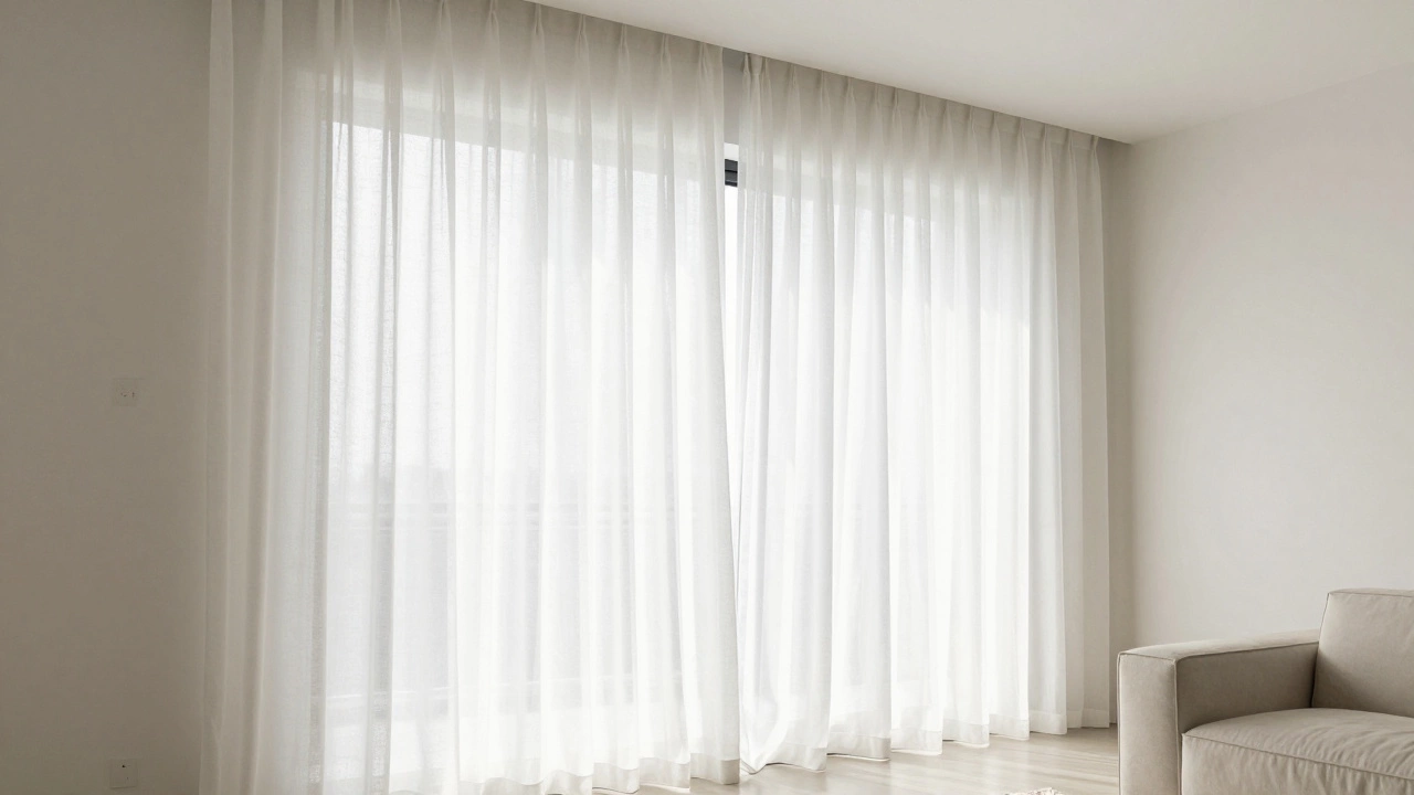
White Curtains are the gold standard for maximizing perceived space because they reflect the most light and blend seamlessly with most wall colors. They create a seamless transition from the window frame to the rest of the room, preventing the eye from stopping at the window edge.If your walls are painted a light neutral-think off-white, pale gray, or soft beige-matching your curtains closely to that shade creates a monochromatic effect. Your brain struggles to distinguish where the wall ends and the window begins. This lack of contrast removes visual "noise," making the room feel larger and more cohesive. It’s a simple trick used by professional interior designers for decades.
- Pure White: Best for modern, minimalist spaces with high ceilings.
- Cream/Ivory: Warmer option for traditional homes or rooms with wooden floors.
- Light Gray: Adds slight depth without sacrificing brightness, great for contemporary styles.
Monochromatic Magic: Blending In
One of the most effective ways to make a room look bigger is to eliminate hard lines. Hard lines chop up space. When your curtains contrast sharply with your walls (e.g., navy blue curtains on white walls), you create a distinct boundary that defines the limit of the room. To expand the room, you want to blur those boundaries.
This is where the concept of tonal harmony comes in. You don’t have to stick to stark white if it feels too sterile. Instead, choose a curtain color that is one or two shades lighter or darker than your wall paint. For example, if your walls are a medium sage green, try curtains in a pale mint or a very light olive. The subtle variation adds texture and interest without creating a visual stop sign.
In Auckland, where many homes feature large glass panels to capture the coastal breeze, using sheer or semi-sheer curtains in tones that match the exterior view can also help. If you have a garden view, soft greens or blues can extend the indoor space outward, merging inside with outside. This technique, known as "borrowed scenery," makes the room feel less enclosed.
Why Dark Colors Can Work (If Done Right)
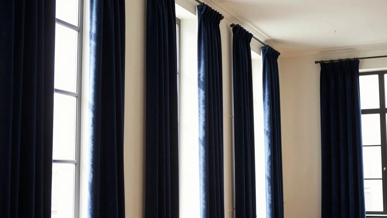
Here’s a controversial take: dark curtains can sometimes make a room look bigger. It sounds counterintuitive, right? Dark absorbs light, so shouldn’t it shrink the space? Yes, but only if used incorrectly. However, if you use dark colors strategically, they can create depth rather than confinement.
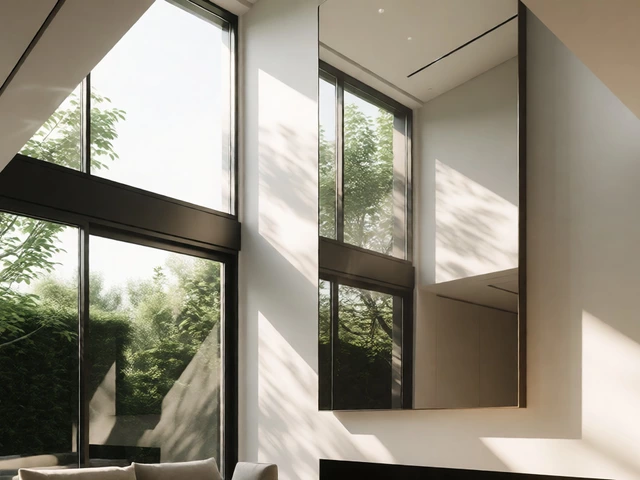
Think of a black hole. It doesn’t block your view; it pulls your eye in. Similarly, a deep charcoal, navy, or forest green curtain can recede visually if the rest of the room is bright. This works best in rooms with high ceilings or large windows. The dark fabric acts as a backdrop, making the ceiling appear higher and the window frame more prominent. It’s all about contrast management.
| Color Category | Effect on Space | Best Used With | Risk Factor |
|---|---|---|---|
| Light Neutrals (White/Cream) | Expands significantly | Any wall color, low light | Can look sterile if not textured |
| Tonal Matches | Blurs boundaries | Painted walls, mid-tone decor | Requires precise color matching |
| Dark Hues (Navy/Charcoal) | Adds depth/recedes | High ceilings, bright walls | Makes room feel smaller if walls are dark too |
| Bold Patterns | Distraction/Chaos | Large, open spaces | Overwhelms small rooms quickly |
Just remember: if you go dark, keep everything else light. Dark curtains with dark walls and dark furniture will turn your room into a cave. Balance is key.
The Role of Texture and Fabric Weight
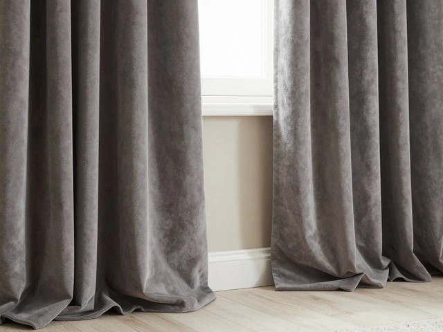
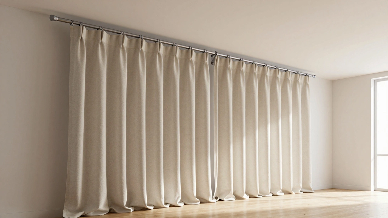
Color isn’t the only factor. The material of your curtains plays a huge role in how much space they seem to occupy. Heavy, thick velvets or brocades add physical bulk. Even in white, a heavy velvet curtain looks dense and can make a small room feel cluttered. On the other hand, lightweight linens, cottons, or sheers float gently. They catch the breeze and move, adding dynamism without weight.
In humid climates like New Zealand’s, linen is particularly popular because it breathes well and wrinkles naturally, adding organic texture. A wrinkled linen curtain in a soft beige looks relaxed and airy. It doesn’t hang stiffly like a formal drape. This casualness contributes to the feeling of spaciousness. Formal, structured drapes signal "closed off" and "heavy." Casual, flowing fabrics signal "open" and "light."">
Consider the lining too. Unlined or lightly lined curtains allow more light to filter through. Fully blackout linings, while great for sleep, can make the fabric look thicker and darker from the front. If you need blackout features, consider installing them separately behind sheer decorative curtains.
Hanging Height Matters More Than You Think
You can have the perfect color, but if you hang your curtains wrong, the room will still look small. One of the biggest mistakes people make is hanging curtains directly above the window frame. This cuts the wall space in half and draws attention to the height of the window, not the height of the room.
To make a room look taller-and therefore bigger-hang your curtain rod as close to the ceiling as possible. Aim for 4-6 inches below the crown molding or plaster cornice. Then, let the curtains pool slightly on the floor or just kiss it. This vertical line draws the eye upward, emphasizing the ceiling height. It’s a simple adjustment that yields dramatic results.
- Measure from the ceiling down, not from the window frame up.
- Use wide rods that extend 6-10 inches beyond the window frame on each side. This allows you to pull the curtains fully back, exposing more glass and letting in more light.
- Avoid short curtains. Curtains that end at the sill or halfway down the wall make the room look shorter and cut off.
Patterns: To Use or Not to Use?
When trying to make a room look bigger, patterns are tricky. Large, bold prints (like giant florals or geometric shapes) can overwhelm a small space. They create visual noise that confuses the eye and makes the room feel busy and cramped. Small, subtle patterns, however, can add interest without shrinking the space.
If you love patterns, opt for small-scale designs like tiny polka dots, fine stripes, or delicate botanicals. Ensure the background color of the pattern is light. A white background with thin navy stripes will still read as light and airy from a distance. Avoid high-contrast patterns where the background and foreground colors clash violently. That kind of vibration makes the eye tired and the room feel smaller.
Solid colors are generally safer bets for small rooms. They provide a clean, uninterrupted surface that reflects light evenly. If you want pattern, introduce it through cushions, rugs, or artwork instead. Keep the large vertical surfaces-your curtains-simple and calm.
Natural Light and Window Orientation
The direction your windows face changes how colors appear. North-facing windows receive cooler, indirect light. South-facing windows get bright, direct sunlight. East and west faces change throughout the day. In Auckland, with its mix of sun and cloud, understanding this helps you choose colors that stay consistent.
In north-facing rooms, pure white can sometimes look cold or bluish. Warm whites, creams, or light greys with warm undertones work better. They add warmth without darkening the room. In south-facing rooms, you have more freedom. Bright whites look crisp and clean. You can even experiment with pastel colors like soft yellow or powder blue, which reflect the abundant sunlight beautifully.
If your room has limited natural light, avoid any color with a strong tint. Stick to neutrals. Any hint of color absorbs more light than pure white. The goal is to maximize reflection. Think of your curtains as mirrors that bounce light around the room.
Common Mistakes to Avoid
Even with good intentions, it’s easy to slip up. Here are the most common pitfalls that make rooms look smaller:
- Contrasting trim: Using a dark valance or header on light curtains breaks the vertical line and chops the height.
- Too many layers: Adding pelmets, tie-backs, and multiple swags adds bulk and clutter. Keep it simple.
- Ignoring the hardware: Thick, ornate brass rods can look heavy. Sleek, minimal rods in matte black or brushed nickel blend in better.
- Wrong width: Curtains that are too narrow look skimpy and cheap. They should be at least double the width of the window when closed to create full, generous folds.
Also, consider the view outside. If you have a beautiful garden or cityscape, don’t hide it. Choose sheer curtains or light-filtering fabrics that maintain visibility. Obscuring a nice view with heavy, opaque curtains closes off the room psychologically. Letting the eye travel outside expands the perceived boundaries of your home.
Final Thoughts on Spatial Illusion
Making a room look bigger isn’t about changing its dimensions; it’s about managing perception. Light colors, tonal harmony, proper hanging height, and lightweight fabrics all work together to create an illusion of space. You don’t need to knock down walls or spend thousands on renovations. Sometimes, swapping out old, dark, heavy curtains for fresh, light, airy ones is enough to transform a cramped box into a welcoming sanctuary.
Start with the light. Reflect it, don’t absorb it. Blend your curtains with your walls, not against them. And always, always hang them high. Your eyes will thank you, and so will your guests.
Do white curtains really make a room look bigger?
Yes, white curtains are highly effective at making a room look bigger because they reflect the maximum amount of light. By bouncing natural and artificial light around the room, they reduce shadows and create a sense of airiness. Additionally, if matched closely to your wall color, they blur the boundaries between the window and the wall, removing visual interruptions that define the limits of the space.
Should my curtains match my walls exactly?
They don't have to match exactly, but they should be within the same tonal family. Matching the exact shade creates a seamless, monochromatic look that maximizes space. However, choosing a shade one or two steps lighter or darker can add subtle depth without breaking the visual flow. The key is to avoid high contrast, which creates hard lines that chop up the room.
Can dark curtains make a small room look bigger?
It's possible, but risky. Dark curtains can create a sense of depth if the rest of the room is very bright and the ceiling is high. The dark fabric can recede visually, acting like a void that pulls the eye inward. However, in most small rooms with average lighting, dark curtains will absorb light and make the space feel smaller and cozier, not bigger. Stick to light colors for guaranteed expansion.
How high should I hang my curtains to make the room look taller?
Hang your curtain rod as close to the ceiling as possible, ideally 4-6 inches below the crown molding or plaster cornice. This draws the eye upward and emphasizes the height of the room. Never hang the rod directly above the window frame, as this cuts the wall space in half and makes the ceiling appear lower.
Are patterns okay for small rooms?
Small, subtle patterns are okay, but large, bold prints should be avoided. Big patterns create visual noise that overwhelms a small space and makes it feel cluttered. If you want pattern, choose small-scale designs like tiny dots or fine stripes on a light background. Solid colors are generally the safest and most effective choice for expanding perceived space.