Unlocking the 70 30 Rule in Interior Design: Perfect Balance for Every Room
The best rooms rarely shout—they just feel right. No, it’s not sorcery. It’s the 70 30 rule in interior design at work. Imagine walking into a home where the couch, the walls, even the little picture frames all somehow sing together. You want to look around and stay a while. This mix isn’t accidental. It’s classic design wisdom, and, funny enough, there’s real math behind it. So, why do some spaces feel so effortlessly put together? It’s all thanks to this incredibly simple yet smart rule—once you know what it is, you’ll spot it everywhere.
What is the 70 30 Rule? Breaking Down the Numbers
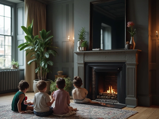
Think about getting dressed. Most people don’t wear head-to-toe neon pink. They’ll wear jeans and maybe a hot pink shirt or shoes. Same for interiors—the 70 30 rule means letting one design style or color take up about 70% of your room’s look, with the other 30% adding some spark. This is also called the ‘rule of dominance and contrast.’ It works everywhere: colors, materials, styles, even furniture shapes.
Professional designers swear by this method. The 70% is usually the star—your main wall color, the big sectional, the large rug. The 30% is your supporting act: a bright lamp, those graphic cushions, quirky art. Can you get creative? Sure! The 70 30 split doesn’t mean you have to use just two colors. For example, within the 70%, you might have three shades of beige, and in your 30%, you mix gold, navy, and lilac, and it still works. The actual split is usually not measured to exact square inches—it’s more about the vibe than the math. But that comfort you feel when you walk into a space? It’s often down to this balance.
If you’re a numbers lover, there’s real brain science here. Human vision craves a sense of order, but too much uniformity sends us to sleep, and too many accents can stress us out. The 70 30 rule walks that perfect line. According to a 2020 Cornell study, people consistently rate asymmetrical but proportionally balanced designs as more comfortable and inviting. Balance makes the brain happy, and the 70 30 rule is an easy way to get there.
How to Use the 70 30 Rule in Real Rooms
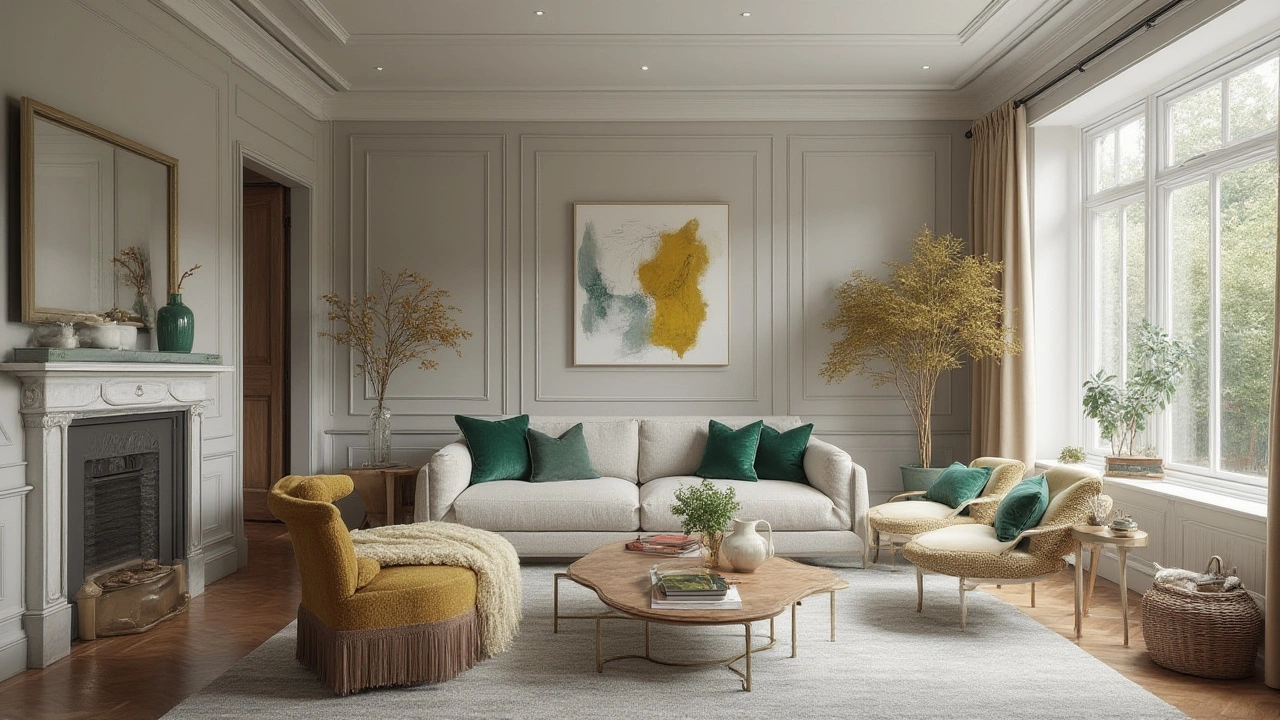
All right, let’s get out of theory and make this practical. Imagine you’re redoing your living room. Choose your base color or main style—let’s say warm grey walls and a big neutral sofa. That’s your 70%. What about your 30%? This is where you bring in those mustard yellow pillows, a patterned rug, metallic lamp bases, and maybe some wild art—these extra pieces wake up the whole room.
The trick is not to stop at just color. This rule stretches to every design decision. Want a minimalist home with a shot of vintage? Let minimalism dominate (think clean lines, neutral palette) but let 30% of the room feature antique frames, a retro mirror, or a chunky old-school table. Blending rustic with modern? Easy—make 70% modern: sleek surfaces, smooth tiles, then slip in that lived-in leather chair or reclaimed wood cabinet for your 30% of cozy.
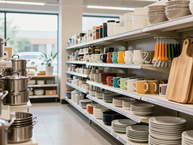
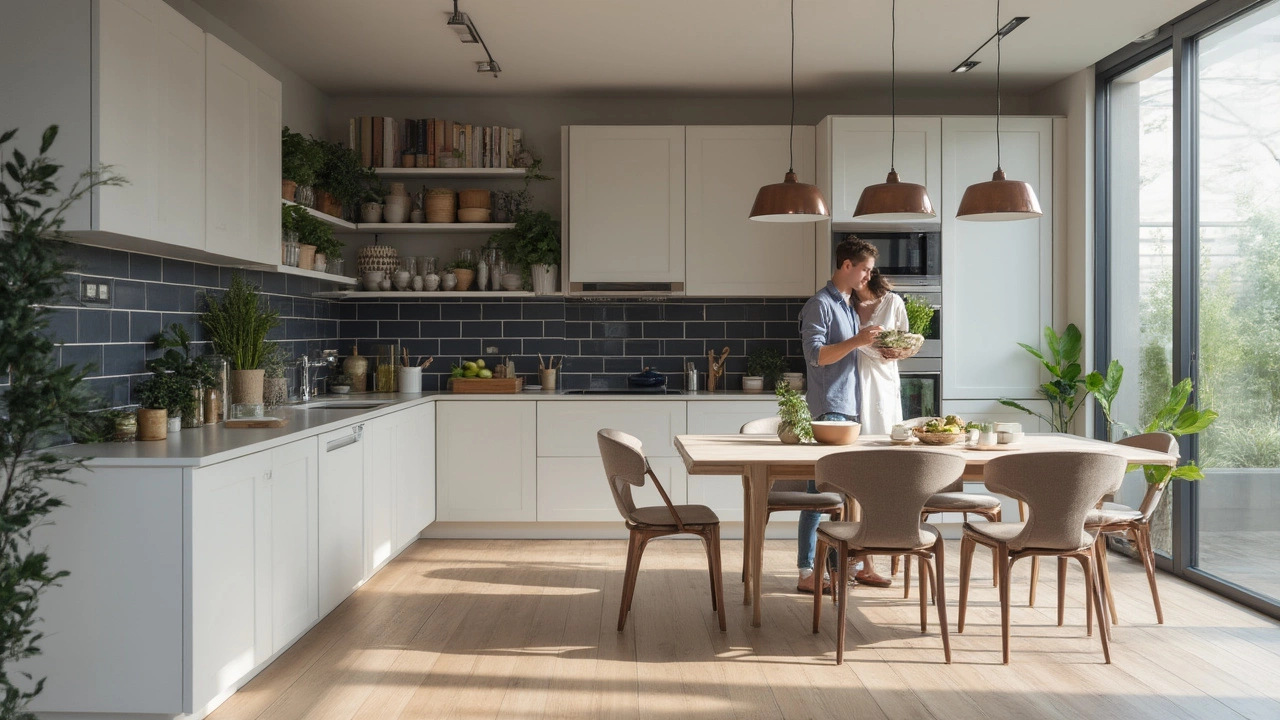
Kitchen feeling flat? Go for 70% classic white cabinetry, then layer in 30% through teal bar stools, open shelving with colorful plates, or statement pendant lights. The best spaces often layer style, not just color. Check out this table showing how different elements can use the 70 30 rule:
| Element | 70% (Base) | 30% (Accent) |
|---|---|---|
| Color | Soft white walls | Emerald green cushions & art |
| Style | Modern lines | Boho textiles |
| Material | Wood flooring | Brass light fixtures |
| Texture | Smooth upholstery | Chunky knits, velvet throws |
| Pattern | Solid furniture | Bold patterned rug |
Some folks stress about getting the ratio perfect. Don’t. If you feel like your space is mostly one vibe with a twist of something else, you’re nailing it. Want a more playful take? Try letting your furniture be the 70 while accents make up 30. Or, flip the ratio for a punchier look—like a moody, dramatic dining room full of color, balanced by 30% white.
Why the 70 30 Rule Works: The Psychology of Balance
You’re probably thinking: why 70 30, not 50 50 or 80 20? There’s psychology here, and it’s surprisingly clever. Balanced spaces that aren’t completely symmetrical feel more natural. Our brains like a little unpredictability. Seventy percent lets your eye rest—it’s the calm, the clean start. That 30% gives energy, personality, and keeps nerves from fraying.
There’s a timeless appeal to this split. If you peek inside classic European homes, mid-century modern California pads, even sleek Tokyo apartments, you’ll notice the formula at work. Why? When your eye knows where to look but still gets one or two surprises, you end up with a space that’s memorable, not boring.
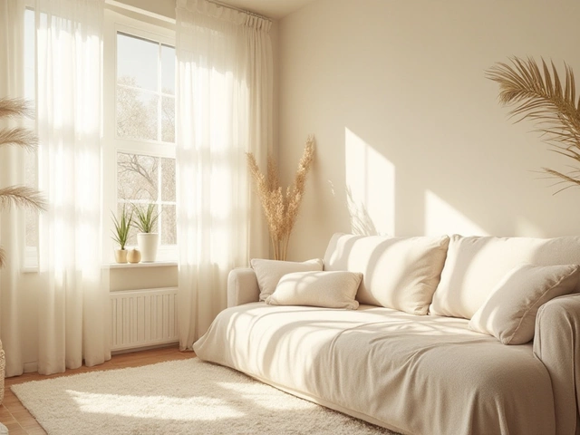
Want a room to feel bigger? Let the 70 be pale shades or light woods. Want cozy vibes? Make 70% deep navy or chocolate brown, then lift things with lighter accent pieces. Even retailers know this trick. Walk into any West Elm, IKEA, or Anthropologie showroom and spot those clusters of bold art and textiles against a simple backdrop. That’s the 70 30 rule, front and center.
Designers like the late Terence Conran or Kelly Wearstler almost always use this method, even if they play with bold color. In Wearstler’s hotels, it’s often a sea of velvety grey, with flashes of chartreuse or metallics. She goes big with drama, but there’s always balance. The rule works beyond style—kids’ rooms, rental updates, even boring bathrooms get a jolt with this ratio. If you can remember to give your eye a place to rest, plus a little surprise, you’re halfway to a magazine-worthy space.
Common Mistakes with the 70 30 Rule—and How to Fix Them
Let’s be real—it’s easy to go off the rails. Maybe you get carried away with wild prints, or the room ends up feeling too bland. The 70 30 rule saves you from both extremes. The first mistake? Not enough contrast. If your 30% accents are too timid, they vanish, and you’re left with monotone territory. Try adding something extra-bold: swap navy pillows for lipstick red, or add a crazy geometric rug to wake up that sea of beige.
Another classic slip-up is clutter. Think the 30% means 'go wild'? Nope. You still need editing and space around your accents. If every surface screams for attention, even the 70 30 magic can’t calm the chaos. Take a photo of your space and look at it in black and white—do the accents pop, or does everything blur together? If so, pare down and try again.
One more thing: Don’t forget about scale! A giant orange painting in a white room counts for a lot more than a sprinkle of orange candles. Proportion goes beyond numbers—it’s about visual weight. If your 30% gets all the attention, the room can tilt into circus territory. Ask yourself, would you want to spend hours in your space, or do you feel exhausted after five minutes? If the latter, it’s time to shift the balance.
Here’s a tip: before you buy anything new, check what you already have. Sometimes, swapping a lampshade or adding one colorful throw is all you need. And remember, natural materials (plants, woven baskets, stone vases) make perfect 30%ers—no color required. Don’t ignore pattern and shape in your mix, either. Swapping a round mirror for a square one, or mixing rough with glossy textures, all counts toward your accent layer.
Expert Tips for Mastering the 70 30 Rule at Home
Okay, you’re sold. You want that put-together feel designers always nail. Where do you even begin? Start simple. Pick your anchor—usually a wall color, big rug, or dominant furniture finish. Let 70 30 rule guide the rest. If you love a soft green couch, build that into your 70%. Then make 30% of the room pop with pink throws, brass lamps, and a vintage chinoiserie tray.
Try this formula in one corner before overhauling the whole space. Got a neglected reading nook? A cream chair and white shelves set the base, while bold yellow pillows and a striking plant give it life. Snap a picture; does it look balanced? If something feels off, try adjusting the ratio—add a basket, switch out art, or pull back an accent.
Bored of the same-old? You can flip the rule upside down for dining rooms and powder baths that thrive on drama. Think 70% wallpaper or jewel-toned paint, 30% white wainscoting, glass light fixtures, or a marble vanity. The flip works for bold personalities or small spaces where you want instant wow.
Paint and textiles make fast, affordable changes. If you’re renting or on a budget, work with what you’ve got by swapping pillow covers, layering throws, or clustering accent decor on shelves. Smart storage can keep clutter at bay so your 30% doesn’t spill over. And if you get stuck, remember: take a step back, ask what’s dominant, and add or subtract accents until your eye feels happy—not overwhelmed or bored.
The 70 30 rule is basically your shortcut to looking like you hired a pro—no endless mood boards necessary, just a sharp eye and a little curiosity. Experiment, trust your gut, and know that perfect balance is surprisingly simple, once you've tried it the first time.