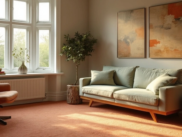
Designer Bathroom Tones: How to Choose Colors That Last
When we talk about designer bathroom tones, the carefully selected color schemes used in high-end bathrooms to create mood, depth, and lasting appeal. Also known as bathroom color palettes, these tones aren’t just about looking nice—they shape how you feel every time you step in. Think of it like picking the right soundtrack for your morning routine. A cool, muted grey can feel like a quiet breath. A warm beige can feel like sunlight on skin. And a deep navy? It turns your bathroom into a private retreat, not just a room with a toilet.
Luxury bathroom design, the intentional combination of materials, lighting, and color to elevate everyday routines into sensory experiences doesn’t mean gold taps and marble floors. It means harmony. It’s why the best designer bathrooms you see in magazines often use just three colors—maybe a soft white, a muted sage, and a charcoal accent. They avoid trends. They focus on texture: the matte finish of a ceramic sink, the grain of wooden shelving, the subtle sheen of a well-made mirror. That’s what lasts. That’s what feels expensive without screaming it.
And it’s not just about the walls. Your bathroom accessories, the small fixtures and decor items like towel bars, soap dispensers, and mirrors that complete the look and function of the space need to match the tone. A brushed brass faucet looks sharp against warm grey tiles. A black soap dispenser pops against white. But if your towels clash or your mirror frame is too busy, the whole thing falls apart. That’s why top designers start with tone, then build around it—not the other way around.
You don’t need a full remodel to get this look. Even swapping out your shower curtain for a textured linen one, or switching your lightbulbs to a warmer Kelvin rating, changes the whole vibe. The right spa bathroom, a bathroom designed to feel like a calming, restorative escape, often using natural tones, soft lighting, and minimalist accessories isn’t about expensive gear—it’s about intention. It’s about choosing colors that don’t just look good, but feel good. That’s why you’ll see the same tones repeated across the best designs: warm whites, earthy neutrals, soft greens, and deep, grounding greys. These aren’t random choices. They’re proven to reduce stress, improve mood, and make even a small bathroom feel like a sanctuary.
What you’ll find below are real examples from actual homes—how people used these tones to fix tired bathrooms, how lighting changed the way colors looked, and what small swaps made the biggest difference. No fluff. No trends that fade in six months. Just clear, practical ways to make your bathroom feel like it was designed for you—not for a catalog.
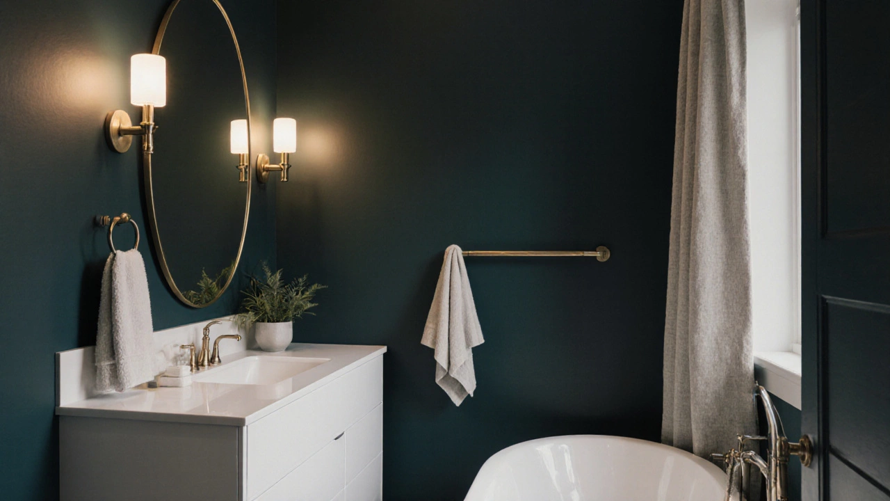
What Colors Make a Bathroom Look Expensive? Expert Picks That Actually Work
Discover the most effective colors to make a bathroom look expensive without spending a fortune. From deep neutrals to warm metals, these expert-approved palettes create luxury with just paint and smart details.
Categories
- Storage (30)
- Sofas (23)
- Bathroom (21)
- Curtains (17)
- Kitchenware (14)
- Bedding (13)
- Rugs (13)
- Cushions (13)
- Mirrors (13)
- Home Decor (12)
Popular Articles