Color Proportion: How to Balance Hues in Every Room
Ever walk into a room and feel something’s off, even if you love the colors? Most of the time it’s the proportion of those colors. Getting the right balance makes a space feel calm, lively, or sophisticated without shouting.
Why Color Proportion Matters
Our eyes love variety, but they also need a rhythm. When one shade dominates too much, the room can feel cramped or overwhelming. A well‑scaled palette guides the eye, creates depth, and highlights the features you want to show off. Think of it like a recipe – a pinch of spice, not the whole bottle.
Simple Ways to Get the Right Balance
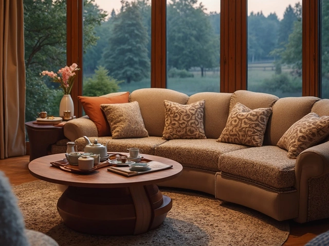
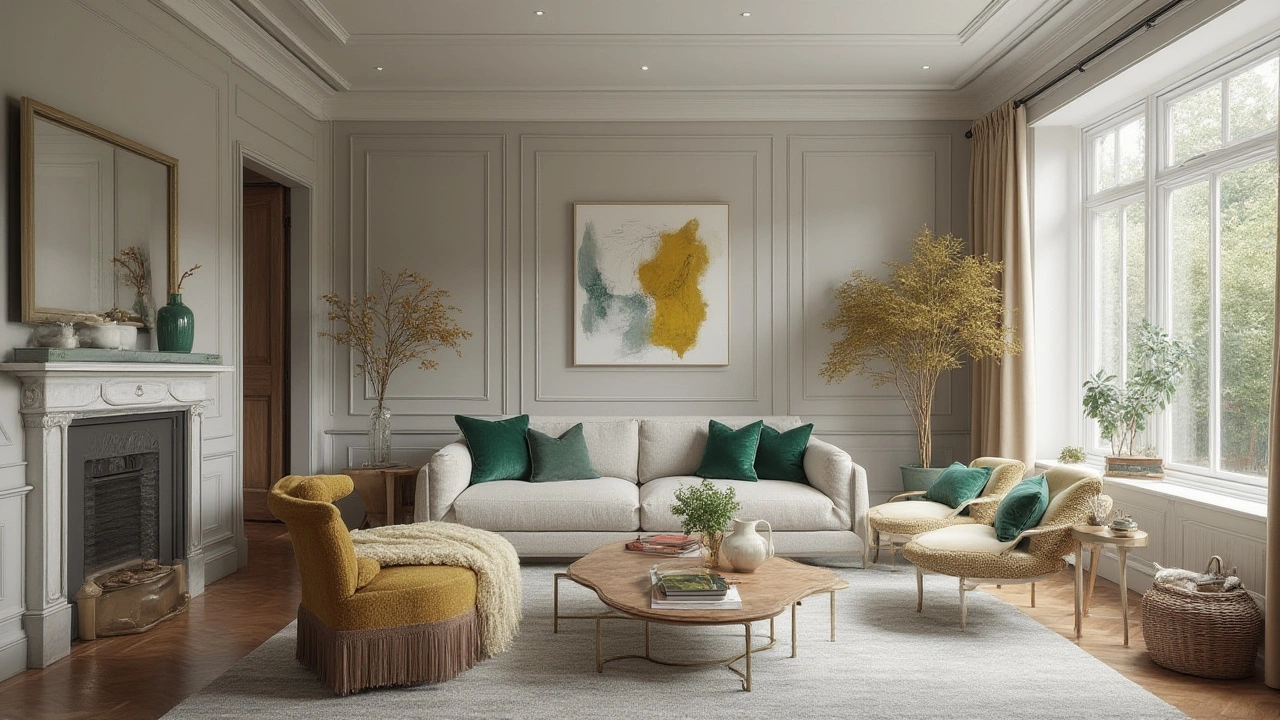
1. Start with a 60‑30‑10 rule. Let 60% be a neutral or base color (walls, large furniture), 30% a secondary shade (sofa, rugs), and 10% an accent (pillows, décor). This framework instantly keeps things from looking too busy.
2. Use the 3‑color limit. Stick to three main hues in a room. Adding more can muddy the effect unless you’re going for a bold, eclectic look. Choose one dominant tone, one complementary, and one pop color.
3. Test with swatches. Before committing, hold fabric swatches or paint chips together. Walk around the room at different times of day; natural light can change how colors blend.
4. Play with texture. If you’re using similar hues, vary the material – matte curtains with glossy cushions – to keep the visual mix interesting without adding new colors.
5. Anchor with accessories. Small items like vases, lamps, or artwork can introduce a new shade without tipping the balance. Rotate these pieces seasonally for a fresh feel.
When you apply these steps, you’ll notice how the room shifts from ‘just painted’ to ‘thoughtfully designed.’ For example, a living room with a soft gray wall (60%) and a deep blue sofa (30%) feels grounded. Add a few mustard pillows (10%) and you have a focal point that draws the eye without clashing.
Remember, color proportion isn’t a strict rule set in stone. It’s a guide that helps you avoid common pitfalls like over‑matching or color chaos. If something feels right to you, trust that feeling – the goal is a space you love to live in.
Ready to try it out? Pick a room, pick your three colors, and follow the 60‑30‑10 split. In a weekend you’ll have a room that looks intentional, balanced, and totally you.
Unlocking the 70 30 Rule in Interior Design: Perfect Balance for Every Room
Discover how the 70 30 rule in interior design creates harmony, the science behind it, and easy ways to use it for stunning, balanced rooms.
Categories
- Storage (30)
- Sofas (23)
- Bathroom (21)
- Curtains (17)
- Kitchenware (14)
- Bedding (13)
- Rugs (13)
- Cushions (13)
- Mirrors (13)
- Home Decor (12)
Popular Articles