Color Matching Tips for Easy Home Makeovers
Ever stare at a room and wonder why it feels off? Most of the time it’s the colors not talking to each other. The good news? You don’t need a design degree to fix it. Grab a paint swatch, a pillow, or a curtain rod and follow a few simple rules.
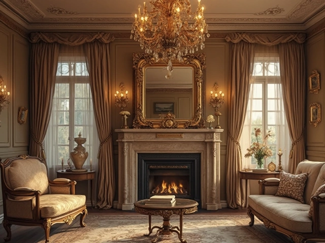
Start with the 70/30 Rule
The 70/30 rule is a shortcut many designers use. Pick one dominant color for about 70% of the space – think walls, large rugs, or a sofa. Then choose a secondary color for the remaining 30% – cushions, lamps, or artwork. This balance stops the room from feeling chaotic.
For example, a light grey wall (the 70%) pairs well with navy cushions (the 30%). The contrast adds interest without overwhelming the eye. If you love bold shades, let the dominant color be a softer version and save the bright hue for accents.
Match & Mix: Practical Tricks
1. Use a color wheel. Opposite colors like blue and orange create energy. Adjacent colors like teal and mint feel calm. Pick what mood you want and stick to it.
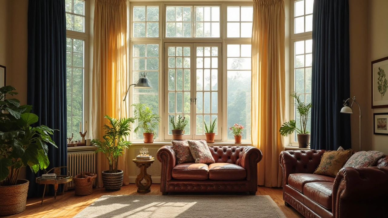
2. Match to a focal point. If you have a patterned rug, pull one of its colors for your curtains. Our post on curtain length shows that hanging curtains just a few inches above the floor works with any color scheme because it keeps the line clean.
3. Play with cushion trends. 2025 is all about deep greens and warm terracotta. Pair a neutral sofa with a few of these cushions and you instantly update the room without buying new furniture.
4. Don’t forget mirrors. A mirror can reflect color and make a small space feel bigger. Choose a frame that matches your secondary color for an extra tie‑in.
5. Layer shelf liners. If you line a pantry shelf with a pastel liner, add containers in a matching hue. It’s a tiny detail that makes the whole kitchen feel cohesive.
6. Test before you commit. Paint a large poster board and hold it up to your walls. Light changes how colors look, so check at different times of day.
Putting these steps together saves time and money. You don’t have to redo everything – just swap a few accessories and the room transforms.
Remember, color matching is about feeling good in your space. If something looks right to you, it probably is. Play, experiment, and enjoy the process. Your home will thank you.
Should Curtains Be a Darker Colour Than the Room? Practical Advice for Homeowners
Picking curtain colors gets tricky fast—should they be darker than your walls, or lighter? This article digs into what actually happens when you pick dark or light curtains compared to your room color. You’ll get real tips on visual balance, style, and things you might not even think about, like room temperature and cleaning. Whether you want your space cozy or bright, you’ll know by the end what works best. We’ll skip the jargon and get straight to what matters for your home.
Categories
- Storage (30)
- Sofas (23)
- Bathroom (21)
- Curtains (17)
- Kitchenware (14)
- Bedding (13)
- Rugs (13)
- Cushions (13)
- Mirrors (13)
- Home Decor (12)
Popular Articles