Carpet Color: How to Pick the Right Hue for Every Room
Staring at a blank floor can feel overwhelming, but picking a carpet color isn’t rocket science. The trick is to think about the room’s purpose, the light it gets, and the vibe you want. Below you’ll get practical steps you can try right now, no design degree required.
Start with Light – Bright vs. Dark
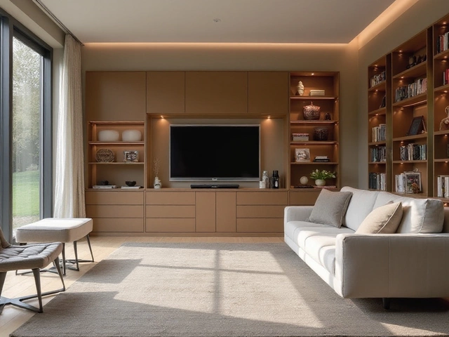
If your space feels cramped, a light carpet can open it up. Whites, creams, and soft pastels bounce natural light around, making a small bedroom or hallway feel bigger. On the flip side, a dark rug – charcoal, navy, or deep brown – can anchor a large living room and hide foot traffic marks. Test a swatch on the floor at different times of day; you’ll see how the shade shifts with sunlight and artificial bulbs.
Match Your Furniture and Walls
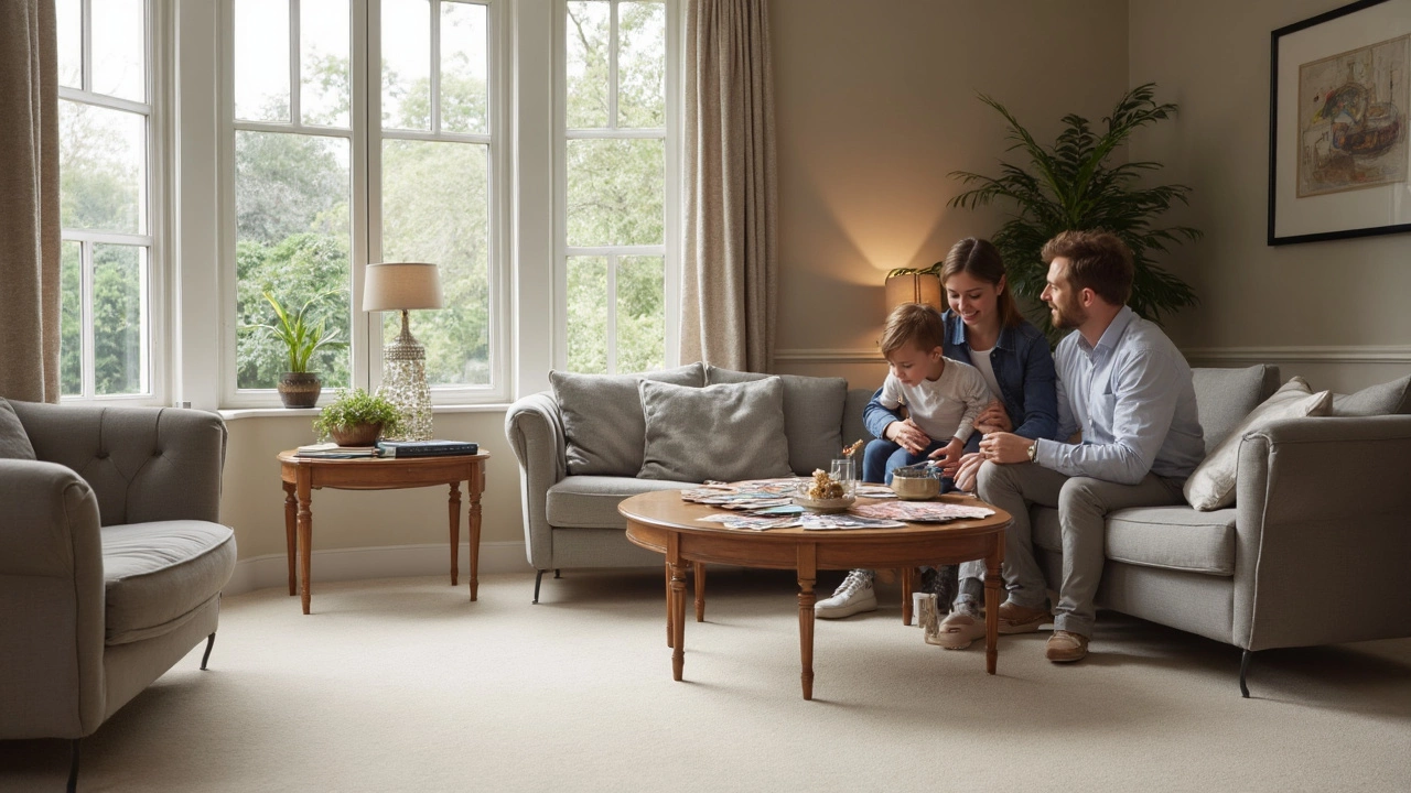
Look at the biggest pieces in the room. A sofa in a bold colour can be balanced with a neutral carpet, letting the sofa shine without a clash. If your walls are a neutral shade, you have freedom to add a pop‑color rug for excitement. For patterned furniture, keep the carpet simple; a solid colour won’t compete with busy prints.
Another easy rule: pick a carpet that shares a tone with something else in the room. If you have a teal accent pillow, a carpet with a hint of teal will tie the look together without being overwhelming.
Don’t forget the floor underneath. A light carpet over a dark hardwood can create contrast, while a dark rug on light wood feels more seamless. If you’re unsure, lay the rug on a sheet first – you’ll see the effect without committing.
Consider Lifestyle and Maintenance
Kids and pets? You’ll want a colour that hides spills and stains. Mid‑tone greys, muted blues, and earthy beiges are forgiving. If you love a low‑maintenance floor, look for carpet fabrics that are stain‑resistant and easy to vacuum.
For high‑traffic entryways, think about durability as well as colour. A darker shade may look better after months of shoes and backpacks, while a light rug can become an eyesore fast.
Use Colour Theory Simply
Complementary colours are opposite on the colour wheel – like orange and blue. Pairing a warm orange rug with cool blue walls creates a lively balance. Analogous colours sit next to each other – think green, teal, and blue – and give a calmer flow. You don’t have to be an artist; just pick one main colour and choose a carpet that sits next to it or opposite it for a quick win.
When in doubt, stick to a neutral base and add colour through accessories – pillows, throws, or artwork. This lets you change the look later without swapping the carpet.
Try Before You Commit
Most online stores let you order a small sample for a few pounds. Place the sample on the floor, walk on it, and see how it feels underfoot. If you have friends over, ask their opinion – fresh eyes spot clashing tones you might miss.
Remember, the perfect carpet colour is the one that makes you feel comfortable and matches how you live. Use these easy guidelines, have a bit of fun, and you’ll end up with a floor that ties the whole room together.
Should Carpet Be Lighter or Darker Than Furniture? Best Picks for Your Space
Trying to decide if your carpet should be lighter or darker than your furniture? This article breaks down the real pros and cons of each choice, showing how carpet color affects the look and feel of your room. Learn how to balance colors without making your space look smaller or dated. Get expert tips for choosing a carpet that complements your style and lifestyle. Say goodbye to color confusion and pick a carpet that truly works for you.
Categories
- Storage (30)
- Sofas (23)
- Bathroom (21)
- Curtains (17)
- Kitchenware (14)
- Bedding (13)
- Rugs (13)
- Cushions (13)
- Mirrors (13)
- Home Decor (12)