Should Carpet Be Lighter or Darker Than Furniture? Best Picks for Your Space
If you're staring at a bunch of carpet samples and wondering if they should be lighter or darker than your sofa and chairs, you're definitely not alone. This is one of those design questions that can completely change the vibe of your whole place. The color of your carpet doesn't just blend into the background—it sets the tone, makes spaces feel bigger or smaller, and even hides (or shows) every crumb and stain.
Here's something a lot of folks don't realize: lighter carpets usually create a more open and airy feeling, but they can turn into a nightmare if you've got pets or kids. Darker carpets look sharp and do a better job of hiding dirt, but they can make a room feel a bit cozier—and sometimes smaller—especially if your furniture is also on the dark side. It's not just about looks, though. The right carpet shade can save you time and stress in cleaning, too.
- How Carpet Color Influences Room Mood
- Matching vs. Contrasting: Pros and Cons
- Practical Tips for Picking the Right Shade
- Common Mistakes to Avoid
How Carpet Color Influences Room Mood
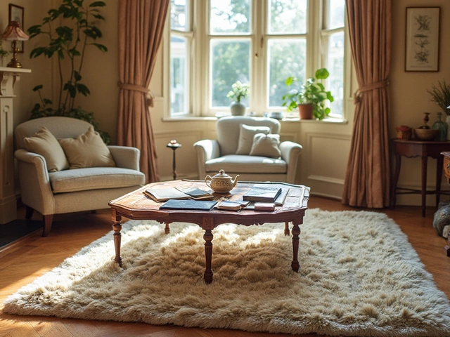
It’s wild how much the color of your carpet can change the whole feel of a room. Lighter carpets, like off-white, cream, or pale gray, bounce light around and make spaces look bigger and brighter. This works great in smaller rooms or areas that don’t get a ton of sunshine. If your aim is openness or a breezy vibe, a light color sets that tone instantly.
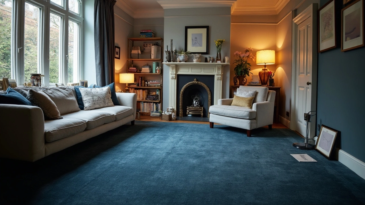
On the flip side, dark carpets—think navy, deep charcoal, or chocolate brown—add a cozy and grounded feel. They’re awesome in big rooms that can feel a bit cold or empty otherwise. People also lean towards dark rugs in places where spills are likely, just because they hide stuff better. Here’s an interesting tidbit: retailers see fewer returns for medium-to-dark toned carpets, simply because they look newer for longer and people don’t stress about stains as much.
| Carpet Color | Mood/Effect | Best For |
|---|---|---|
| Light (beige, cream) | Makes space feel bigger, brighter | Small rooms, low light areas |
| Medium (gray, taupe) | Balances light and warmth, easy to match | High-traffic rooms, family rooms |
| Dark (navy, brown) | Feels cozy, hides stains | Large rooms, homes with pets/kids |
The mood isn’t just about brightness. Your choice can even influence things like how often you have to vacuum (so if you’re not the tidy type, that matters!). Pairing the wrong carpet color to your furniture can suck the life out of a room or make it feel straight-up awkward. So, dialing in the shade of your carpet really pays off, making your space either chill and open or snug and dramatic.
Matching vs. Contrasting: Pros and Cons
Let’s clear up something a lot of people get stuck on: should you match your carpet color with your sofa, or go for something totally different? The answer isn’t one-size-fits-all, but knowing the pros and cons can save you from some serious decorating regret.
Matching carpet and furniture colors can create a smooth, coordinated look. When you keep things in the same color family (say, a beige rug with a light tan couch), everything feels unified. This is great for small spaces or open-plan rooms because the similar shades make the space look larger and less choppy. It’s also less distracting—your eye just glides across the room without hitting a color “speed bump.”
But matching too closely can make things feel flat or even a little dull. It’s easy to fall into the “beige box” trap, where everything starts to blend together. If you want a bit more visual interest, matching might not give you that pop.
Going for a contrasting look—like a dark grey rug under a pale sofa, or a richly colored carpet with neutral furniture—brings in a lot more personality. Contrasts help define where your furniture ends and your floor begins, which is especially handy if you’ve got cool statement pieces or architectural details you want to show off. Contrasting also works wonders for hiding everyday wear and tear, especially if you choose a patterned rug.
- Pros of Matching: Simple, safe choice. Makes small rooms look bigger. Makes redecorating with accent pillows and throws much easier.
- Cons of Matching: Can look bland. Hard to swap out for new trends or bold decor pieces later.
- Pros of Contrasting: Adds energy and highlights your furniture. Easier to mix and match with accessories. Hides dirt and foot marks better, especially with darker rugs.
- Cons of Contrasting: If you go too bold, you risk clashes or making your room look smaller. Takes a bit more confidence to pull off well.
Here’s a quick cheat sheet if you’re trying to decide which way to go:
| Approach | Good For | Watch Out For |
|---|---|---|
| Matching | Minimal vibes, open spaces, resale value | Too plain or boring |
| Contrasting | Personal flair, highlighting furniture, busy areas | Color clashes, visual busyness |
Think about how much you care about cleaning, how often you switch up your style, and whether you want your floor to blend in or stand out. Your decision between matching or contrasting the carpet with your furniture really sets the mood for the whole room.
Practical Tips for Picking the Right Shade
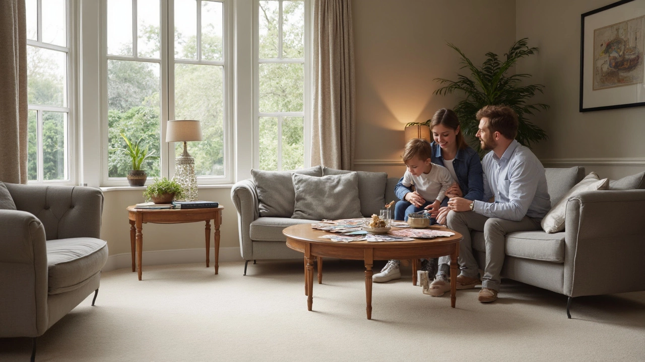
Choosing whether your carpet color should be lighter or darker than your furniture isn't just personal taste—there are a few practical rules that make the choice easier. Start by looking at your lighting. Bright rooms with lots of windows make dark carpets look richer, while rooms with less light get a big boost from lighter rugs that reflect whatever natural light you have.
Next, think about your daily life. Got a big family, pets, or love hosting movie nights with snacks? Darker carpets are more forgiving when it comes to stains and wear, while lighter colors will show every mishap. According to a 2023 home design study, households with pets or young kids are 48% more likely to replace light carpets due to visible stains—so don't just go for the color you like most on the sample swatch.
| Room Type | Recommended Carpet Shade | Why? |
|---|---|---|
| Living Room | Lighter or mid-tone | Opens up the area, easy to match with most furniture |
| Bedroom | Darker | Creates a cozy feel, hides dust and foot traffic |
| High Traffic Areas | Darker or patterned | Better at hiding dirt and stains |
Check how your carpet looks at different times of day. Bring a sample home and put it next to your actual furniture under both natural and artificial light. Colors shift, and what looks perfect under fluorescent store lights might look totally off in your living room at night.
Here are a few quick tricks that actually help:
- If your furniture is very bold or dark, pick a lighter carpet to balance things out. Too much of the same deep color can make your space feel heavy.
- For a sleek, modern vibe, go for a rug that’s one or two shades lighter or darker than your sofa—not a perfect match, but not a huge contrast.
- If you love changing up your decor, choose a neutral carpet in beige, tan, gray, or soft taupe. These shades go with almost anything and won't box you in later.
And don’t ignore the undertones. Some carpets have a yellow or pink undertone that can really clash with blue or green furniture once you see them together. Always check them side by side before buying.
Common Mistakes to Avoid
A lot of people slip up when choosing if their carpet color should be lighter or darker than the furniture. It’s way too easy to make a decision that looks good in the store but doesn’t quite work once you get home. Let's talk about real slip-ups and how to dodge them.
- Forgetting About Lighting: The color you choose can look totally different under your living room lights compared to those bright showroom bulbs. Always check carpet samples at home in both daytime and evening lighting before making your pick.
- Ignoring Foot Traffic: If your living room is the main hangout spot, a light carpet is going to show every footprint, spill, and snack crumb. Cities with rough winters or rainy seasons notice stains faster on lighter rugs—just ask anyone who’s scrubbed a white carpet during a muddy spring.
- Matching Everything: Making your carpet and furniture the same color seems safe, but it flattens out the entire room. Most designers suggest mixing it up: if the couch is dark, try a lighter carpet for contrast, and vice versa. Contrast can make both elements pop and adds instant interest.
- Ignoring Undertones: Here’s something that trips up even DIY pros. Maybe your sofa is ‘gray,’ but is it a cool blue-gray or warm taupe-gray? Pairing carpets with mismatched undertones can make everything look off. Bring fabric swatches and lay them next to your carpet sample in natural light to make sure they play nice together.
- Chasing Trends Without Thinking Practical: Deep blues, forest green, or charcoal rugs look stylish now, but will you love it when you redecorate in two years? Pick a color you actually like long-term, not just what’s blowing up on Instagram.
| Carpet Shade | Percent Reporting High Dirt Visibility |
|---|---|
| Light Beige/Tan | 79% |
| Medium Gray | 42% |
| Dark Brown/Navy | 18% |
Bottom line: Don't just fall for a rug that looks pretty in the showroom. Test swatches at home, balance your colors, and keep daily life in mind. Your space will end up looking put together—and way easier to keep clean and fresh-looking.