Should Curtains Be Lighter or Darker Than a Couch? Design Rules
Curtain & Couch Color Harmony Calculator
Find the perfect balance between your window treatments and seating area. Select your current setup and desired vibe to get expert recommendations.
Your Room Profile
Design Verdict
Why this works:
Visual Simulation
Note: Colors are approximations for demonstration purposes.
Fill out the form on the left to receive personalized curtain advice.
You stand in your living room, holding two fabric swatches. One is a crisp, airy white; the other is a deep, moody charcoal. Your couch sits in the middle of the room, anchoring the space with its solid presence. The question that keeps popping up at home improvement stores and design forums is simple but tricky: should curtains be lighter or darker than a couch? There is no single "correct" answer that applies to every home, because the right choice depends entirely on what you want the room to feel like. Do you want it to feel larger and airier? Or do you want it to feel cozy and dramatic?
Most people assume there’s a strict rule about matching tones, but professional designers know it’s more about contrast and balance. If you get this wrong, the room can feel disjointed-like the window treatments are fighting with the seating area for attention. If you get it right, the curtains and sofa work together to create a cohesive visual flow. Let’s break down exactly how to decide which direction to go, based on light, size, and style.
The General Rule of Thumb: Go Lighter for Airiness
If you are unsure where to start, going lighter is usually the safer bet. When curtains are lighter than the couch, they tend to recede visually. This creates an illusion of height and space. Think about why we paint ceilings white-it pushes them upward. Light curtains do something similar for walls. They reflect natural light back into the room rather than absorbing it.
This approach works best if:
- Your living room is small or lacks large windows.
- You have a dark-colored sofa (like navy, forest green, or black).
- You want a relaxed, coastal, or Scandinavian vibe.
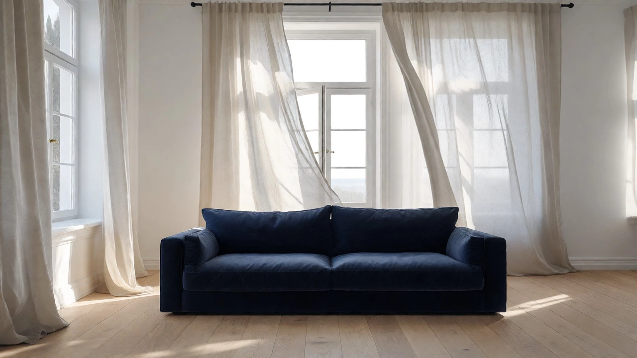
For example, pairing a heavy velvet grey sofa with sheer linen off-white curtains softens the heaviness of the furniture. It prevents the room from feeling like a cave. The lightness of the fabric balances the density of the upholstery. If you live in Auckland, where we love our indoor-outdoor flow, light curtains help blur the line between inside and outside, letting that famous Kiwi sunlight filter through without harsh glare.
When to Choose Darker Curtains for Drama
On the flip side, choosing curtains that are darker than your couch adds weight and sophistication. This is a bold move, but when executed well, it looks incredibly expensive and intentional. Darker drapes frame the window as a focal point, drawing the eye toward the view-or away from an ugly street view-by creating a strong border.
You should consider darker curtains if:
- You have a light-colored sofa (beige, cream, or pale grey).
- The room has high ceilings and plenty of natural light.
- You want a formal, traditional, or modern minimalist aesthetic.
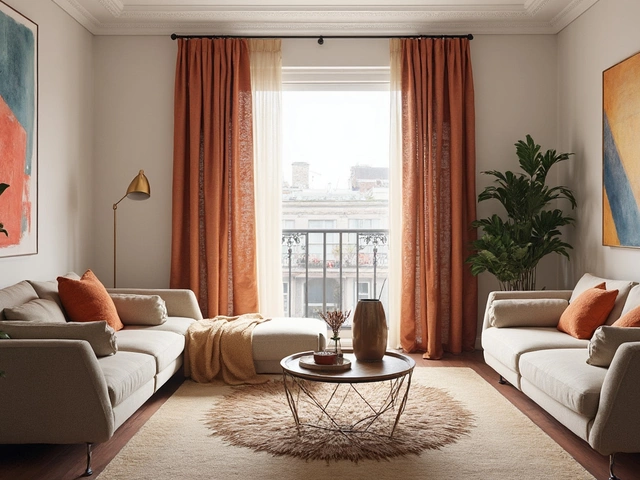
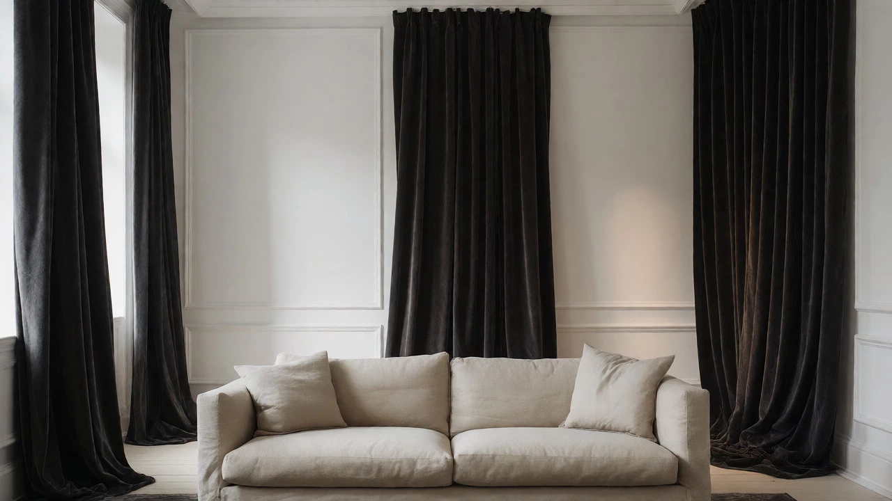
Imagine a beige linen sofa against stark white walls. Without window treatments, the room might feel washed out or sterile. Add floor-to-ceiling charcoal or navy curtains, and suddenly the room has depth. The dark fabric grounds the space. It provides a necessary anchor so the light furniture doesn’t look like it’s floating away. Just be careful: if the room is already dim, very dark curtains can make it feel smaller unless you use rich textures like silk or velvet to catch the light.
The Role of Wall Color in the Equation
You can’t just look at the couch and the curtains in isolation. The wall color is the third player in this triangle. If your walls are neutral (white, cream, or light grey), you have more freedom. You can go lighter or darker with the curtains without clashing. But if your walls are colored, things get trickier.
| Wall Color | Curtain Choice | Effect |
|---|---|---|
| White / Off-White | Lighter or Same Tone | Airy, seamless, expands space |
| White / Off-White | Darker Contrast | Dramatic, frames the window |
| Dark / Moody | Lighter Sheers | Balances darkness, adds softness |
| Colored (e.g., Sage Green) | Neutral (Grey/Cream) | Prevents color overload, calms space |
Here is a pro tip: try to match your curtains to the wall color, not the couch, if you want the window to disappear. If you want the window to stand out, match the curtains to the couch or pick a contrasting accent color. Matching curtains to walls makes the ceiling feel higher because there is no horizontal break in the vertical line of the wall. This is a favorite trick in small apartments where maximizing perceived height is key.
Texture Matters More Than Shade Sometimes
We spend so much time worrying about hue that we forget texture. A dark curtain isn’t always "heavy," and a light curtain isn’t always "flimsy." Texture plays a huge role in how the color reads. A dark blue velvet curtain feels different from a dark blue cotton curtain. Velvet absorbs light and looks richer; cotton reflects it slightly and looks crisper.
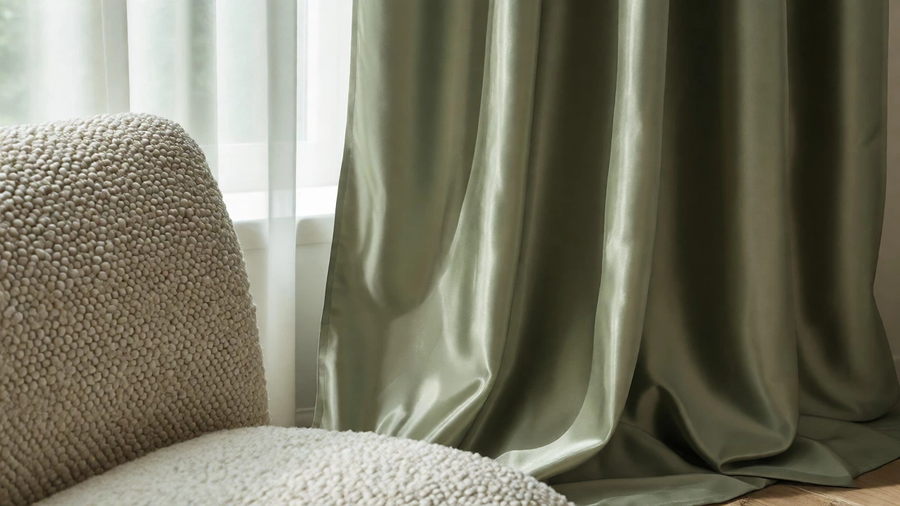
If you are torn between lighter and darker, look at the texture of your couch. Is it a rough weave, like boucle or tweed? Pairing that with smooth, silky curtains creates a nice tactile contrast. If your couch is sleek leather, textured wool or linen curtains add warmth and soften the industrial feel. Don’t let the fear of color stop you from playing with fabrics. Sometimes, sticking to the same tone but changing the material gives you the best of both worlds.
Practical Considerations: Light Control and Privacy
Design isn’t just about aesthetics; it’s about function. How much light do you actually want in the room? If you watch movies in the living room, you need blackout capabilities. Darker curtains generally block more light, even if they aren’t technically lined for blackout. Lighter curtains often require a separate lining to achieve the same effect, which can make them look bulkier.
Also, think about privacy. If you live on a busy street, sheer white curtains might look great but offer zero privacy at night when your lights are on. In this case, darker or heavier fabrics provide better coverage. You can always layer: use sheers for daytime light filtration and heavier drapes for evening privacy. This layered approach lets you switch between "lighter" and "darker" vibes depending on the time of day.
How to Test Before You Buy
Never buy full-length curtains based on a tiny sample in the store. Lighting changes everything. What looks like a soft grey in the shop might look like a cold blue in your north-facing window. Here is a quick checklist to test your choices:
- Get Large Swatches: Order at least A4-sized samples, not postage stamps.
- Tape Them Up: Tape the swatches to the wall next to your couch and near the window.
- Check at Different Times: Look at them in morning sun, afternoon shade, and under artificial lighting at night.
- Step Back: Squint your eyes. Does the curtain blend in nicely, or does it scream for attention? Decide which reaction you prefer.
Remember, colors shift dramatically throughout the day. In Auckland, our weather changes fast, so checking under overcast skies is just as important as checking in bright sun. A curtain that looks perfect in sunshine might look muddy on a rainy Tuesday.
Common Mistakes to Avoid
One big mistake is matching the curtain color too closely to the couch. If they are the exact same shade, the room can look flat and monotonous. You want harmony, not uniformity. Aim for a slight variation in tone or texture to keep things interesting.
Another error is ignoring the length. No matter whether they are light or dark, curtains that don’t touch the floor or pool excessively on the ground will ruin the effect. Floor-length is standard; puddling is optional but risky. Also, avoid hanging curtains too low above the window frame. Mount the rod closer to the ceiling to elongate the wall, regardless of the fabric color.
Finally, don’t ignore the hardware. Rods and rings contribute to the overall look. A thin metal rod might clash with heavy dark drapes, while a chunky wooden rod might overwhelm delicate light sheers. Keep the hardware proportional to the fabric weight.
Can I match my curtains exactly to my couch?
You can, but it’s rarely recommended. Exact matches can make a room look flat and one-dimensional. It’s better to choose a curtain color that is one shade lighter or darker than the couch, or to introduce a complementary color. This creates depth and visual interest while maintaining cohesion.
Do light curtains make a room look bigger?
Yes, generally speaking. Light-colored curtains reflect more natural light, which helps open up a space. They also reduce visual clutter by blending with the walls, making the boundaries of the room feel less defined and thus larger. This is especially effective in small living rooms or spaces with limited windows.
What if my couch is patterned?
If your couch has a pattern, pull one of the secondary or background colors from that pattern for your curtains. Alternatively, choose a solid neutral color that complements the dominant hue of the pattern. Avoid using another busy pattern unless you are confident in mixing prints, as this can quickly become overwhelming.
Are sheer curtains considered lighter?
Sheer curtains are typically treated as "lighter" in terms of visual weight, regardless of their actual color. Even a dark sheer will appear lighter than an opaque drape of the same hue because it allows light to pass through. They are excellent for adding softness without darkening the room.
Does the type of fabric affect the color choice?
Absolutely. Fabrics like velvet absorb light and appear deeper and richer, while silk and satin reflect light, making colors appear brighter and sometimes lighter. Linen has a matte finish that diffuses light softly. Always consider how the specific fabric interacts with light when deciding on a shade.