Carpet Colors: How to Pick the Perfect Shade for Every Room
Choosing a carpet isn’t just about texture; the color can set the mood of a whole space. A wrong hue can make a room feel cramped, while the right one can open it up and highlight your furniture. Below you’ll find simple, practical advice to help you pick a carpet color that works for your home.
Why Carpet Color Matters
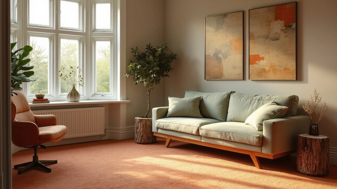
The shade of your carpet interacts with walls, furniture, and even lighting. Light colors bounce more light, making small rooms feel bigger. Dark tones absorb light, adding coziness to large, airy spaces. If you love bold décor, a neutral carpet can let a patterned sofa or bright cushions shine without competing for attention.
Tips for Choosing the Right Carpet Shade
1. Start with the room’s purpose. A home office benefits from a muted carpet that reduces glare, while a family lounge can handle richer colors that hide wear. 2. Use the 70/30 rule. Let 70% of the room stay neutral (walls, large furniture) and 30% bring in color via the carpet, cushions, or art. This balance keeps the space from feeling overly busy.
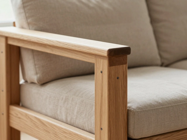
3. Consider existing flooring. If you have hardwood or tiles nearby, pick a carpet shade that complements rather than clashes. A warm taupe carpet pairs nicely with honey‑toned wood, while a cool grey works well next to sleek concrete.
4. Think about maintenance. Light rugs show stains faster, so if you have kids or pets, a low‑maintenance material in a medium tone can be a win. Our guide on "Easiest Rugs to Keep Clean" explains which fibers resist spills and shed less.
5. Test before you buy. Grab a sample and lay it on the floor for a full day. Notice how it looks in morning light, under artificial bulbs, and in the evening. This quick test saves you from a costly mistake.
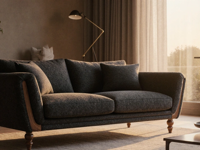
6. Match with cushion colors. If you’re planning to update throw pillows, use the 2025 cushion color trends – think deep navy, muted terracotta, or soft sage – as a reference point. A carpet in a complementary shade ties the whole room together without overwhelming it.
7. Play with texture. A plush, high‑pile carpet can soften bright colors, while a low‑pile or flat‑weave rug works well with darker, saturated tones, adding a subtle contrast that feels intentional.
8. Don’t forget flow. If your carpet runs between two rooms, choose a hue that creates a visual bridge. A light gray can link a white kitchen to a darker living area, making the transition feel seamless.
By keeping these pointers in mind, you’ll find a carpet color that enhances your décor, hides everyday messes, and makes your space feel just right. Ready to refresh your floors? Grab a sample, check the light, and let your favorite shade shine.
Popular Carpet Colors for 2025
Choosing the right carpet color can transform a room's mood. In 2025, homeowners are leaning towards shades that infuse their spaces with warmth and earthiness. Discover how the subtle hues of beige, soft greens, and muted terracotta are making a big impact. This guide will offer insight into the latest trends and provide practical tips for selecting the perfect carpet shade to complement your home decor.
Categories
- Storage (30)
- Sofas (23)
- Bathroom (21)
- Curtains (17)
- Kitchenware (14)
- Bedding (13)
- Rugs (13)
- Cushions (13)
- Mirrors (13)
- Home Decor (12)
Popular Articles