2025 Cushion Color Trends: Hottest Shades and Styling Tips
If you’ve ever wandered into someone’s living room and felt an instant boost of energy or a sudden sense of calm, chances are cushions played a huge part in that moment. A couple of throw pillows can switch up the whole vibe of a room faster than you can scroll through your Instagram feed. But figuring out which colors are in and which should get stuffed in the linen closet? That’s a bit of an art—and as of June 2025, it’s more refreshing and daring than ever. Forget those beige-on-beige days. People are making their sofas pop, styling their outdoor spaces for those endless summer nights, and showing off serious color confidence.
Why Cushion Colors Matter: The Mood, The Flexibility, The Surprises
You might not give cushions much thought beyond picking a few that feel soft, but color plays a starring role in your space. Let’s be real—nobody’s rearranging furniture every season or repainting entire walls just for a fresh new vibe. But toss a handful of new cushions onto your sofa and suddenly things look—and feel—totally different. Color trends for cushions aren’t just random: they reflect what’s happening in the world, what people are craving in their lives, and what designers are experimenting with.
Did you know a study by The Pantone Color Institute found that 62% of participants said the living room is where they most notice color changes through seasonal accents like cushions? That’s no accident. Colors play mind games with us. Cool blues and leafy greens give us spa-day energy, while fiery oranges or bold lilacs add pep to a tired weeknight. Even gold and mustard yellow cushions, which jumped back into the scene in mid-2024, signal warmth and a touch of retro fun. It’s no accident brands launched pillow lines called “Harvest Glow” or “Citrus Pop” last spring—they had a finger on the pulse.
Here’s a scoop: in the last year, Google Trends reported a 42% increase in searches for “bold cushion colors for living room,” outpacing searches for “neutral sofa cushions” for the first time since 2018. You’ll spot this reflected in every major home decor magazine, and it’s amplified further by TikTok and Pinterest creators who make cushion swaps a key part of their before-and-after reels. So yes, if you want your home to have that fresh, on-trend feel, it’s going to start with the cushions.
| Color | Vibe | Where It's Hot |
|---|---|---|
| Rich Greens | Refreshing, Earthy | Living Rooms, Bedroom Accents |
| Amber & Mustards | Warm, Retro | Dining Nooks, Lounges |
| Terra Cotta | Grounding, Cosy | Outdoor Spaces, Sofa Sets |
| Deep Blue | Calm, Moody | Bedrooms, Media Rooms |
| Bougainvillea Pink | Bold, Playful | Kids’ Spaces, Home Offices |
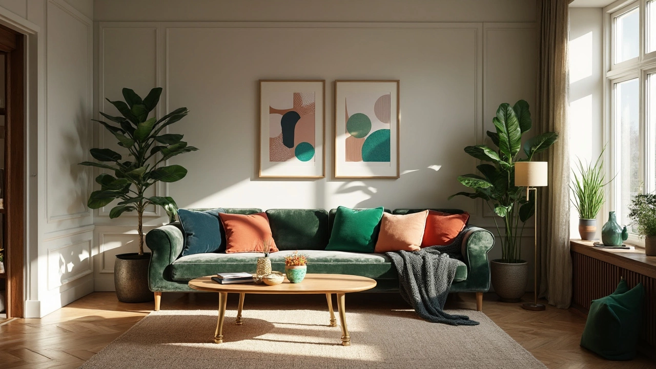
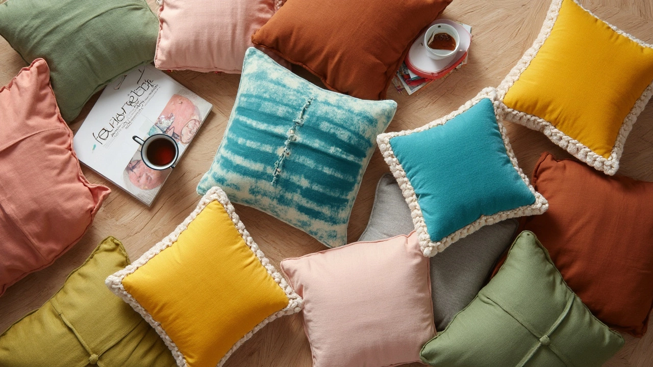
High-contrast color mixing is everywhere. Designers aren’t just pairing navy with cream and calling it a day. Shades like pistachio, ochre, orchid purple, and brick red are all sharing the same sofas. If you think it’s risky, ask yourself: what’s the worst that happens? Cushions are low-stakes and low-cost compared to most decor changes. You can always swap them again next season. Friendly reminder: not every trend will fit your home, and that’s the beauty of it—it’s all about finding a look that feels personal yet fresh.
The Breakout Colors of 2025: What’s Taking Over Sofas, Beds, and Patios
This year, colors for cushions are bolder and brighter than the in-between shades that ruled a few years ago. The neutral look isn’t out, exactly—but it’s getting outshined by fresher, more saturated options. Think Mediterranean-inspired greens, tangy citrus colors, and all those nature-drenched hues you see on travel influencers’ feeds. Designers say it’s less about finding the “perfect match” for your wall color and more about creating playful, unexpected combinations that make you smile.
Let’s break down what’s making waves. One star shade is emerald green, which brings a lush, rich vibe. It’s showing up in linen fabrics, velvets, and even chunky knits. There’s also a quiet revival of sky blue and deep cerulean, with coastal-inspired stripes thrown in for a laid-back look. Mustard yellow hasn’t gone anywhere, but its cousin, burnt gold, is right behind, especially as an accent with dark berry or teal tones. You’ll catch plush velvet cushions in these colors at West Elm, H&M Home, and Anthropologie—nearly every new home catalogue is featuring them on their lead pages.
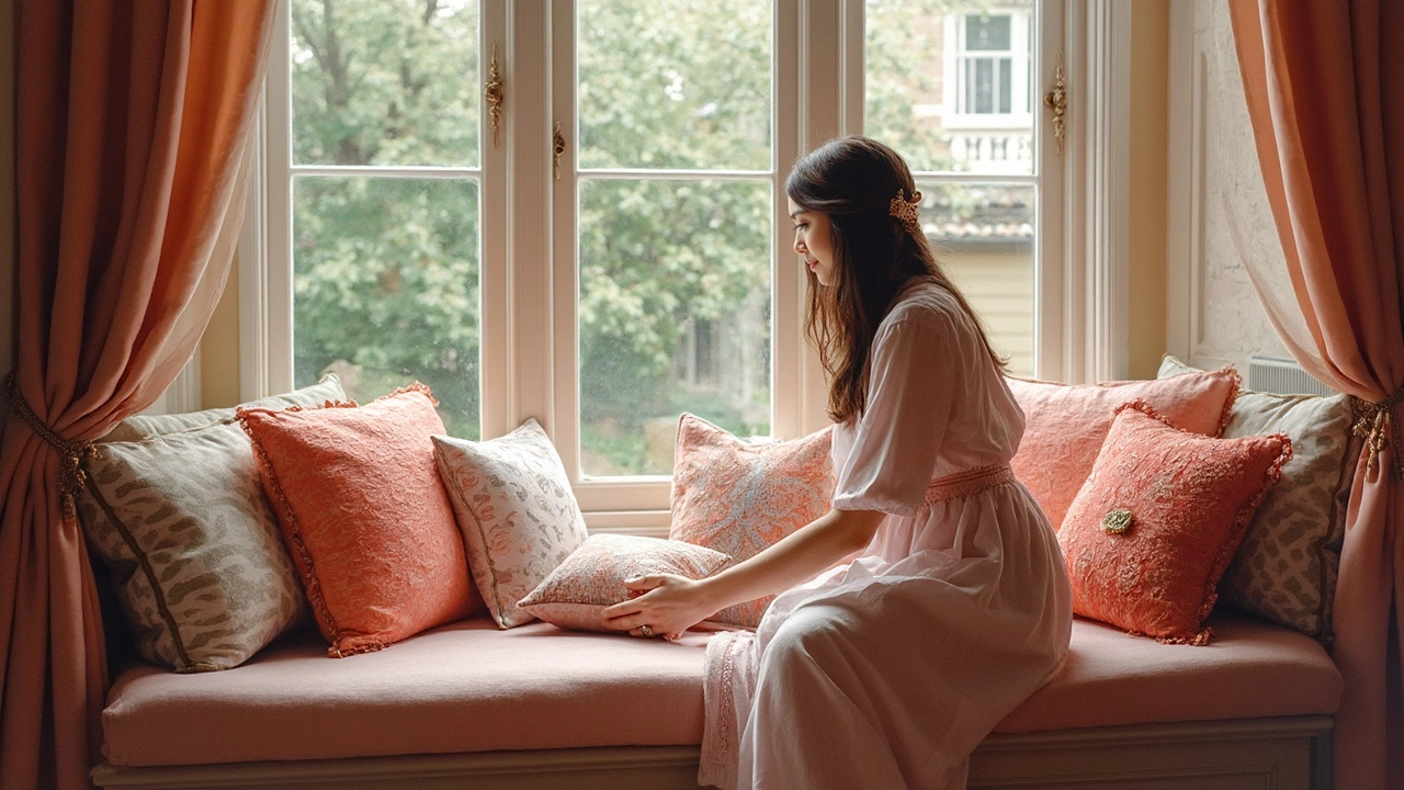
Of course, blush pink refuses to leave the party, but it’s paired now with bolder shades like watermelon red or even forest green rather than pastels. You’ll also spot clay, saffron, and rusty orange, often mixed with tactile fabrics like boucle or fringed cotton. This tactile trend—combining color with textures—was highlighted in the Spring 2025 Maison & Objet report; they even called it the “new maximalism.” The point is not to be shy: playful patterns, abstract prints, and even hand-embroidery are in the mix, giving rooms what designers call a “lived-in luxury.”
If you want a shortcut, here are color combos that are everywhere this season:
- Rich green with ochre yellow
- Clay orange and pale blue
- Mustard or amber with indigo
- Berry tones with blush, paired with off-white
- Pistachio and orchid purple
Watch out for eco-friendly dyes and recycled fabrics, too. Sustainability is a quiet trend that’s becoming mainstream, with brands such as Article and Urbanara using natural pigments and organic cotton. The cool part? Eco dyes often give cushions more dimensional color—think slight variations and depth you won’t get from cheap synthetic fabrics. It’s a win for both style and conscience.
Also, don’t underestimate small, niche makers. On Etsy and Instagram, independent textile artists are pushing the boundaries, creating hand-printed pillows with wild botanicals or unexpected color-blocking. The result: you won’t see these colors and patterns in your coworker’s living room. Digital creators have shared how these “accent rebels” can transform even a plain IKEA sofa, so don’t be afraid to look beyond the big-box stores.
There’s a trick for picking the right trendy hue for your space: look at natural light. North-facing rooms can handle bold, warm shades while sunny spaces won’t get overwhelmed by vivid blues or punchy reds. Designers usually use color swatches or even inexpensive paint samples taped on the sofa or bed to get an idea how the tone will play out at different times of the day. You’d be surprised at how different a deep pea green looks in daylight compared to a cozy, lamp-lit evening. If you’re feeling stuck, try an odd-numbered set like three or five cushions in slightly different shades—it looks intentional and less “matchy-matchy.”
Styling Secrets: Tips to Mix, Match, and Make Your Cushions Pop
Let’s get down to the good stuff. How do you take these hot colors and actually use them without your sofa screaming color overload? Turns out there are some tried-and-true strategies that stylists rely on—and they work whether you’ve got a minimal city studio, a kid-packed family den, or a backyard oasis.
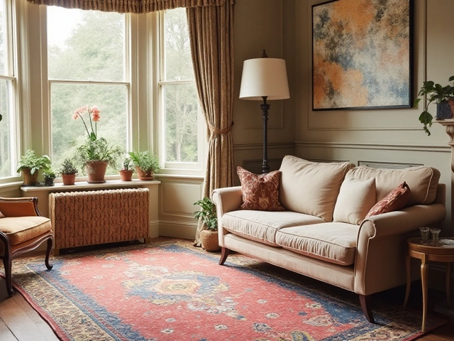
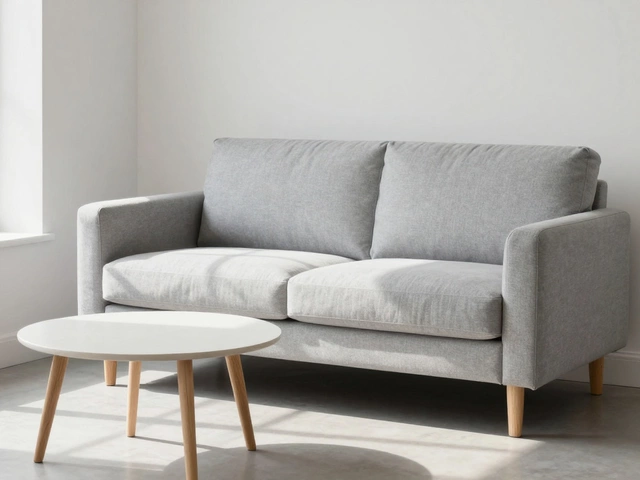
First off, anchor with a classic. Even with bright trends, most designers start with one foundation cushion color, like a deep blue, taupe, or classic *home decor* neutral. Then, add color in odd numbers—either as singles or a trio—because odd groupings always look more intentional and less staged. For balance, pair a bold cushion with two solids or textured fabric pillows in more muted tones. Pinterest boards are full of combos like emerald velvet, nubby beige boucle, and a single punchy patterned cushion.
Another tip: let your rug or a favorite art piece guide your color palette. If you’ve got an orange-and-cream abstract print above your sofa, pull both those shades into your pillow picks and then toss in a wild-card color like icy blue or deep garnet to keep it interesting. If you’re craving something even more layered, play with shape—round or rectangular lumbar pillows break up all those squares and instantly make your sofa look more designed.
Here’s a cheat sheet if you’re nervous:
- Start with a base color from your existing palette (wall, rug, art)
- Choose no more than two bold accent colors
- Add a textural pop—think fringe, knits, velvet, linen
- Arrange cushions with one or two oddball prints for a bit of whimsy
Don’t forget function! If your house is full of pets or kids, look for covers you can wash easily. Several brands now sell “performance fabrics” in vibrant colors—so good luck to grape juice or muddy paw prints. For those sunny patios, opt for UV-resistant covers in those bright shades so they don’t fade after a few weekends.
No style law says you have to swap every cushion at once. It’s often smarter (and more budget-friendly) to buy or swap two or three inserts and let the seasons dictate the rest. For summer, pull in juicy watermelon reds or sky blues; in winter, rich forest or plum. Real people do this—I know more than a few dedicated swappers with a whole shelf of “off-season” covers they rotate through the year. The trick? Keep the inserts the same size, so swapping covers is truly easy-peasy.
And don’t overlook the impact of details—a tassel, a contrasting stitch, or a hand-sewn button can make a plain bold color feel like a custom piece. Retailers from big box stores to boutiques now understand this, and their seasonal drops always feature a handful of clever accents. When in doubt, remember: the most important cushion color trends are the ones that feel personal and make you happy. Trends will shift next season. But comfort, coziness, and a splash of personality are never out of style. Sofa’s ready—now which color is calling your name?